Groove Money
Redesigning Cash Flow with Plaid Integration and Gamification
A focus on transactions, review, and gamification to help users better understand their spending habits and patterns while increasing user engagement.
Client
- The Singleton Foundation for Financial Literacy and Entrepreneurship
The Team
- 2 Product Designers
- 4-5 Software Developers
- 1-2 PMs
- 3 External Stakeholders
Duration & Status
- ~6 Months Late 2024-2025
- Feature Launched Q1 2025
A Snapshot Overview
Groove is a financial literacy web application geared to help young adults grow in their financial literacy skills and confidence.
Through my design audit findings, I initiated a redesign of the Cash Flow feature with the integration of Plaid. In this case study I discuss my journey working through the transaction design pieces.
The result was a successfully launched Cash Flow feature, with a simple transaction review and an onboarding guessing game that helped increase user engagement and user understanding of their spending habits.
The Back Story
What is Groove?
Groove is a financial wellness platform that redefines how people build confidence with money. By blending personalized guidance and behavioral insights, Groove empowers users to develop healthier financial habits.
Who's Our Target User?
Groove targets young adults who feel anxious about managing their money.
What's Cash Flow?
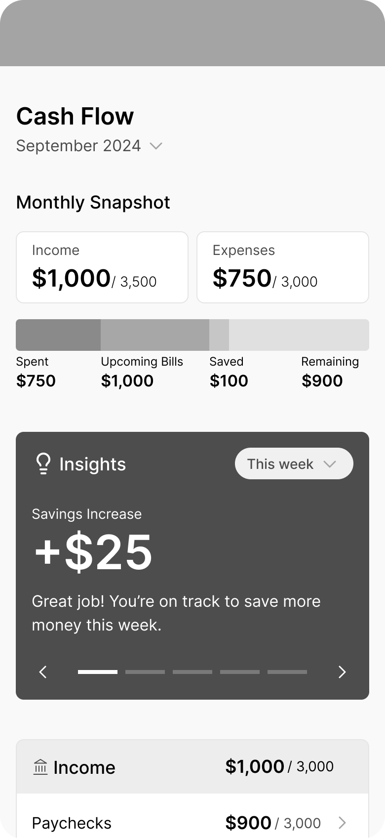
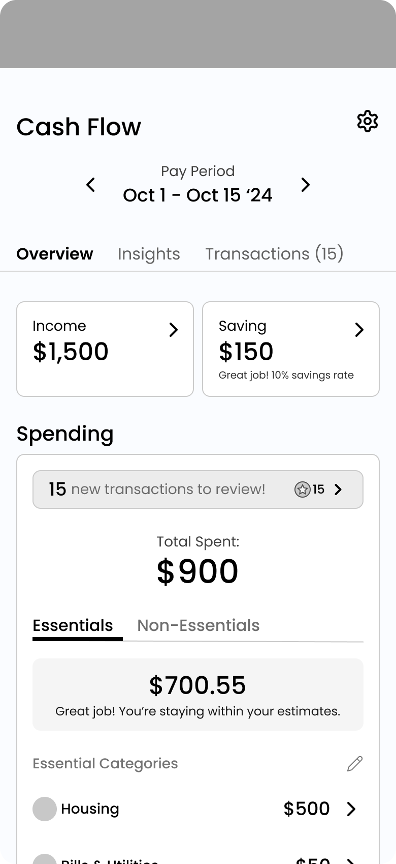
Groove's cash flow feature helps users track their income, expenses, and financial trends to better understand their personal finances.
How Did We Get Here?
Audit Results for the Cash Flow Feature
In mid-2024, we conducted a comprehensive product audit of the Groove application in hopes of making improvements. My focus on the Cash Flow feature revealed key takeaways:
UX Concerns of Manual Data Entry
Manual data entry was a UX concern as it required users to input financial information manually, which was time-consuming, error-prone, and created friction, discouraging consistent engagement.
Limited Guidance and Educational Insights
Limited guidance prevented users from effectively using the tool, hindering financial literacy growth and actionable steps toward their goals.
Confusing and Inconsistent UI Elements
Many of the UI inconsistencies stemmed from "quick-win" client requests, which, while addressing immediate needs, exacerbated design debt.
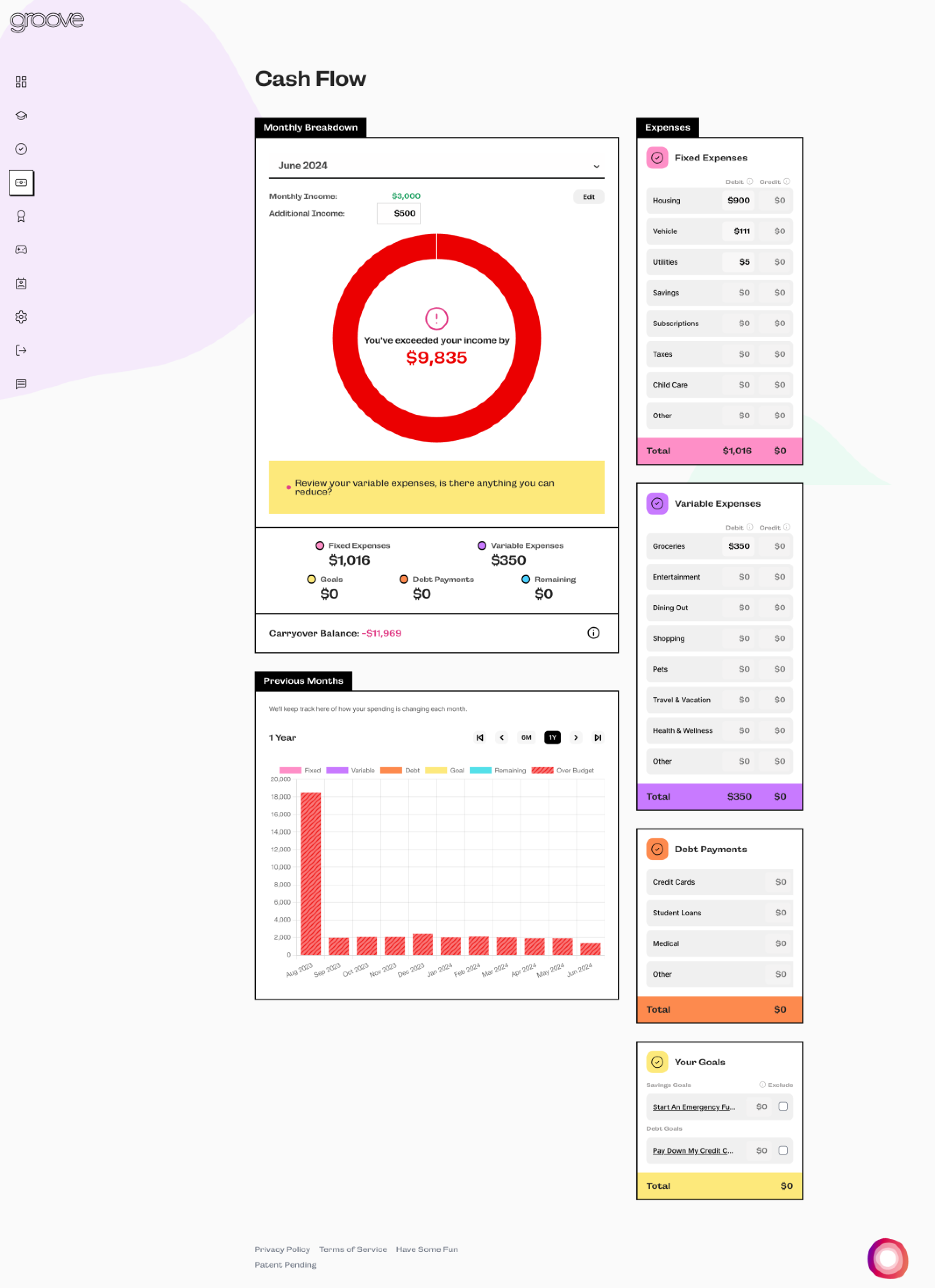
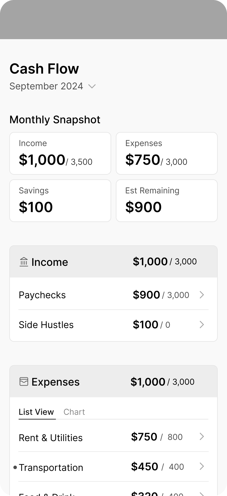
The Old Cash Flow Feature
The Key Result from the Audit...
Plaid Integration
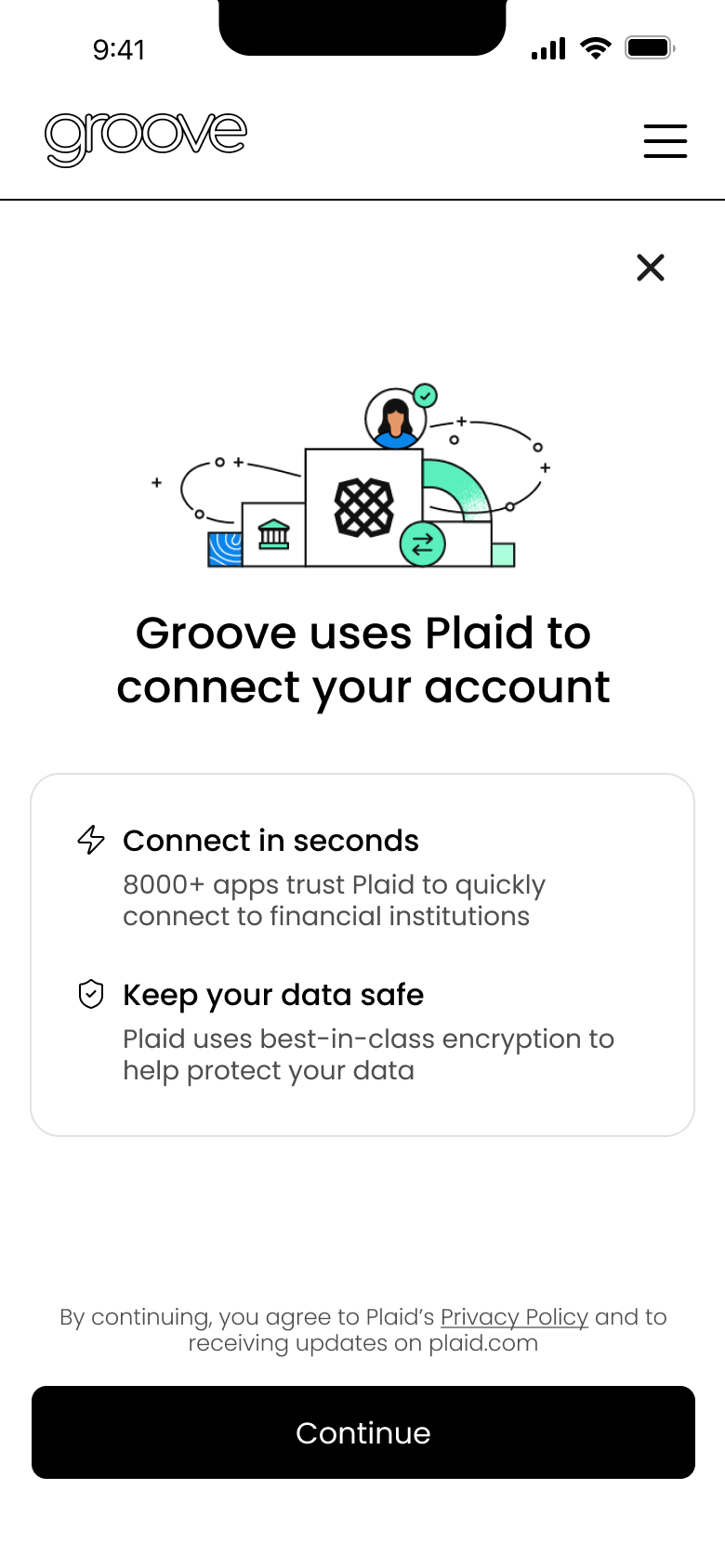
After presenting our findings to external stakeholders, incorporating Plaid became the direction forward to address several key concerns.
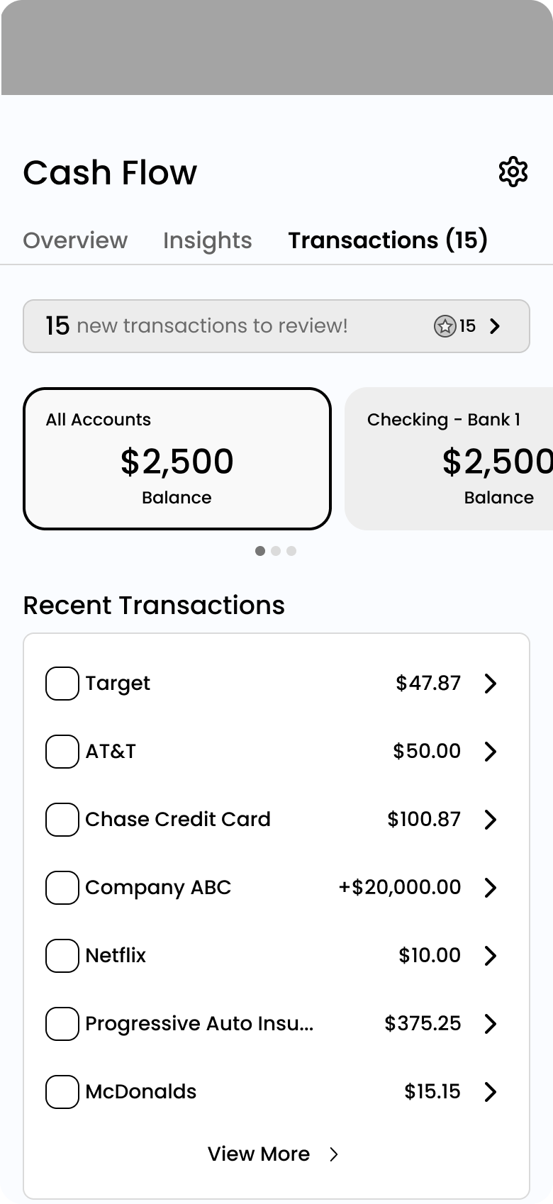
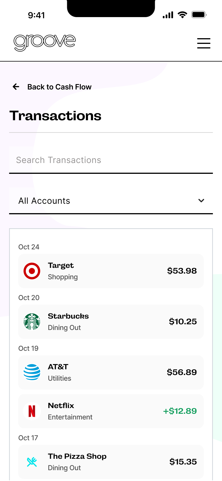
Plaid will allow users to integrate their bank accounts and financial institutions, automatically syncing their transactions with our cash flow feature.
This decision significantly impacted our design direction, providing us with the opportunity to redesign the feature more extensively than initially anticipated.
Defining What We Know
Well, What Should Our Cash Flow Do?
Challenge:
The unclear vision and direction from the client, combined with limited understanding of Plaid, made it challenging to define the purpose of the Cash Flow feature and its intended functionality.
What We Do Know:
Cash Flow is not a budgeting tool:
The client didn’t want Cash Flow to be a budgeting tool because they felt budgeting could cause stress.
Manual categorization of transactions
The client requested users manually categorize their spending to reinforce financial awareness and habits.
Include gamification:
They also wanted to include fun, engaging elements to keep users motivated.
Wireframeing
Using Wireframes to Spark Discussion & Align Stakeholders
With minimal direction from the client and limited user feedback, the wireframes allowed me to explore ideas freely, gather feedback, and shape the Cash Flow tool’s vision without being constrained by the existing design. I used a combination of my previous audit, competitor analysis, and research on Plaid to come up with the initial ideas.
The key questions I kept asking myself was:
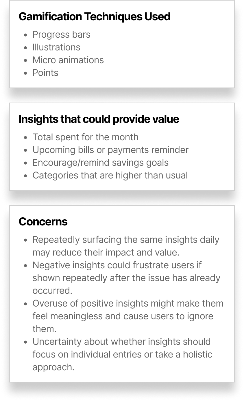
“What information & insights should we surface that are both meaningful, educational, and easy to comprehend for beginners in their personal finance journey?”
Key Takeaway
Focus on Spending Patterns, Financial Rhythm, and User Engagement
Wireframing ideas proved to be extremely beneficial in aligning stakeholders and sparking discussion. It provided a tangible way for me to present ideas, thoughts, and concerns, making it easier for stakeholders to engage and contribute. While many concepts from the wireframes didn’t make it to the final version, surprisingly, several key elements did.
The main takeaway was the alignment in the larger shared vision is to ensure the Cash Flow tool helps users understand their spending patterns and increases user engagement.
Ideation for Transaction Experiences
Defining Transactions
Brainstorming Review Approaches
The Goal
Design a gamified transaction review experience that's valuable, fun, and will help increase user engagement.
The Challenge:
Limited understanding of Plaid's functionality and transaction categorization, and an ambiguous problem space.
The initial request was for users to categorize every transaction to increase their involvement and help them learn about their spending habits. However, there was significant internal pushback, as it was believed this could become tedious over time and potentially deter users who were looking for a simple, easy-to-use tool at the start. With this in mind, I began brainstorming.
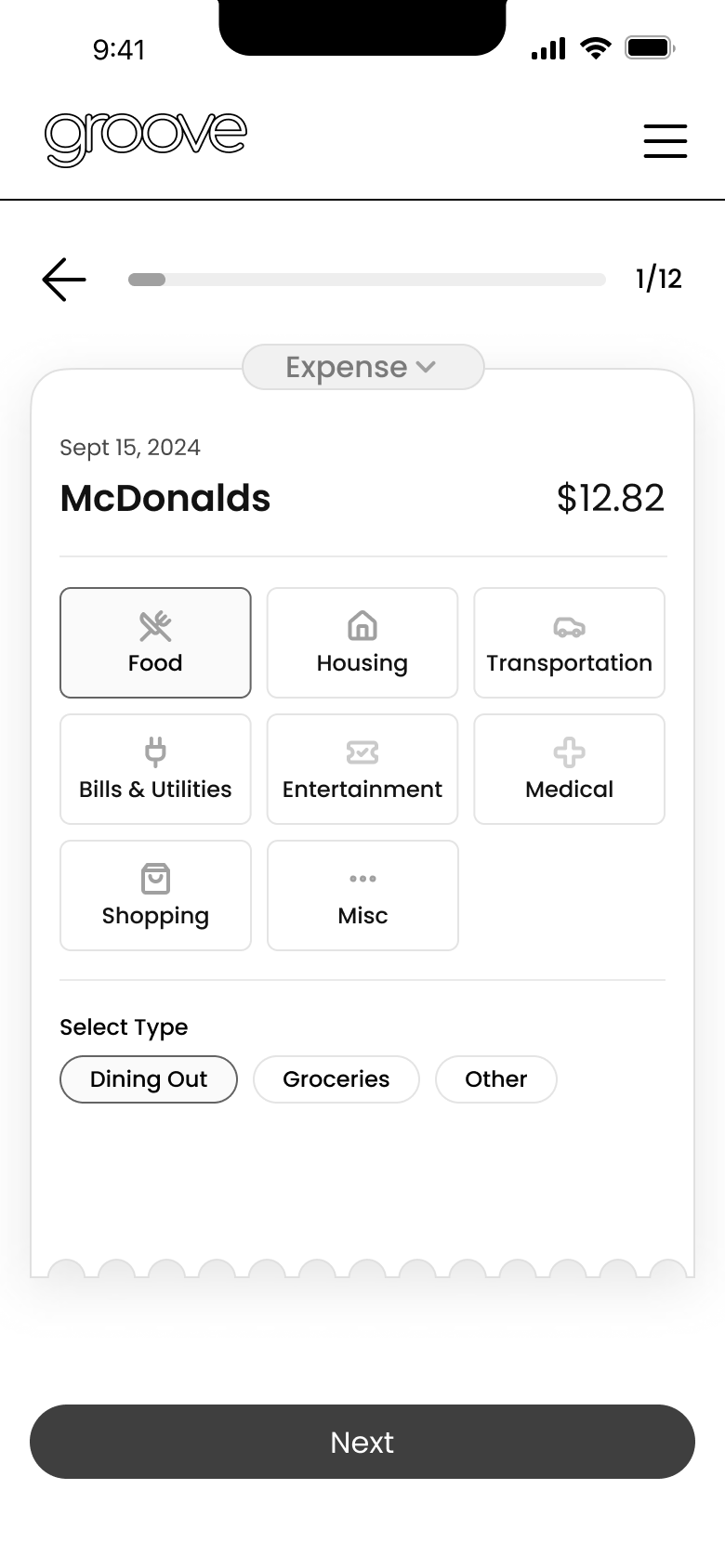
Review Option 2
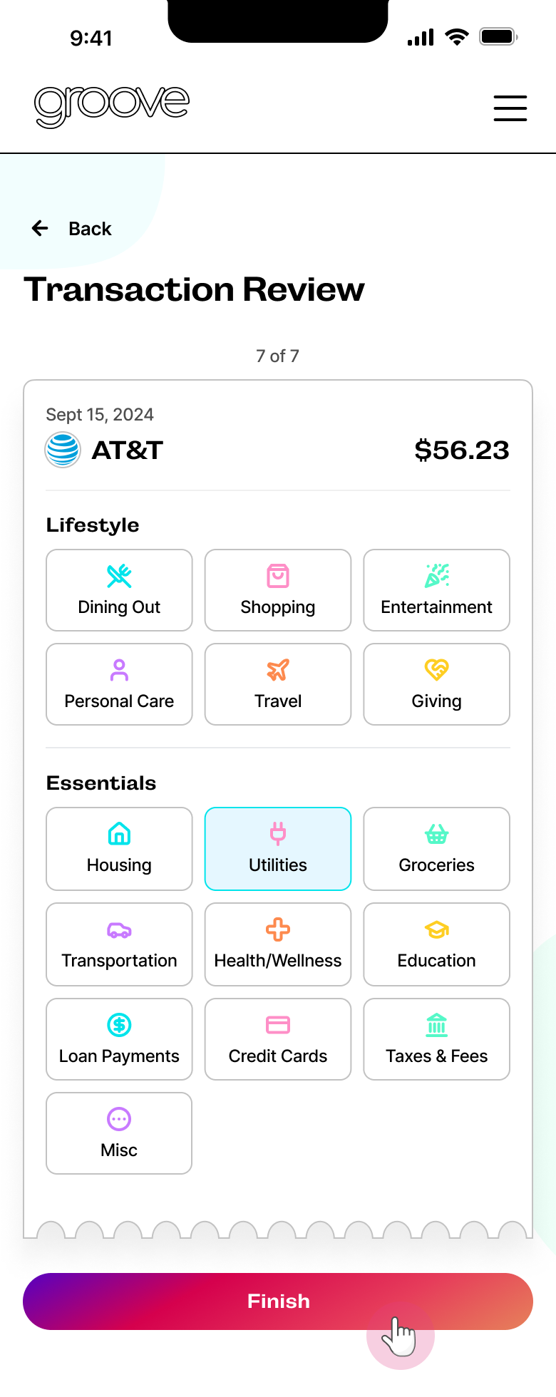
Receipt UI for Simple Sorting
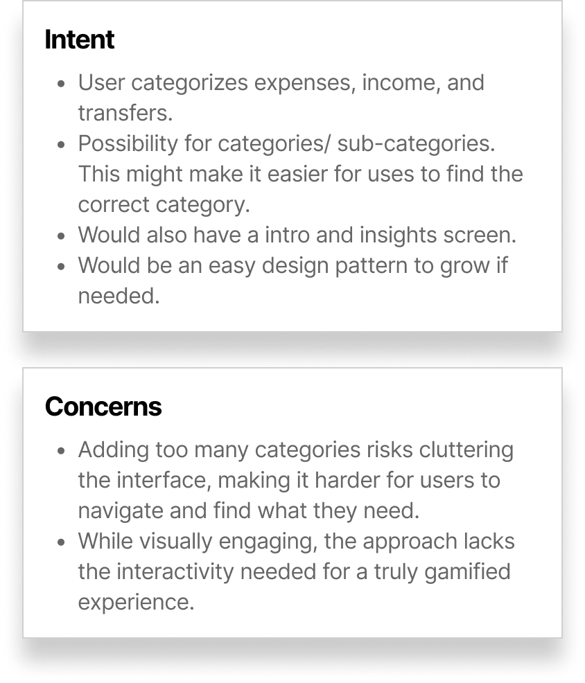
Intent: A simple, visually engaging concept designed to scale easily, accommodating the undefined types and number of categories.
Feedback: Appreciated the visual appeal but sought a more interactive and gamified experience to enhance engagement.
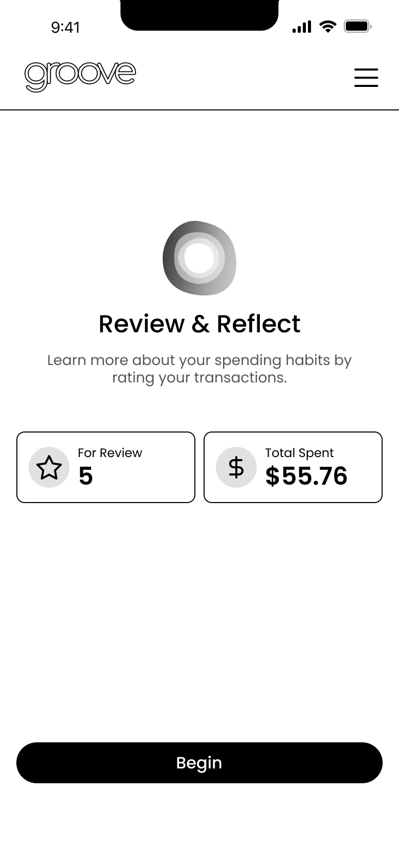
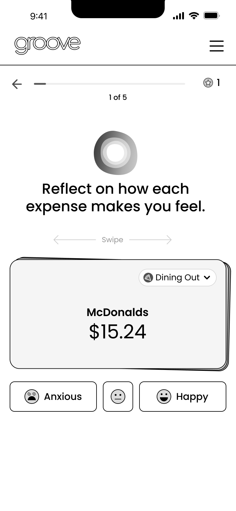
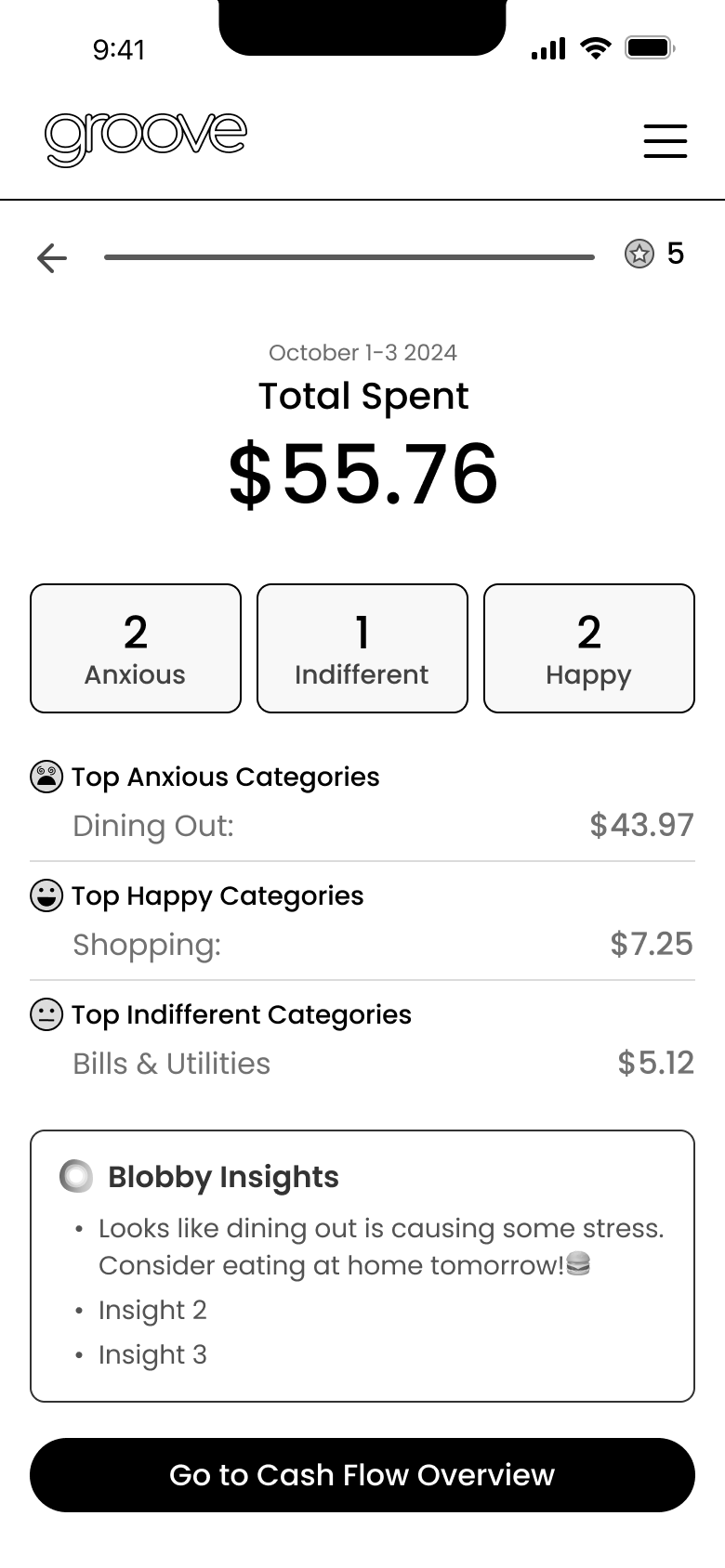
Transaction Review Option 3
Swiping with Feelings Review
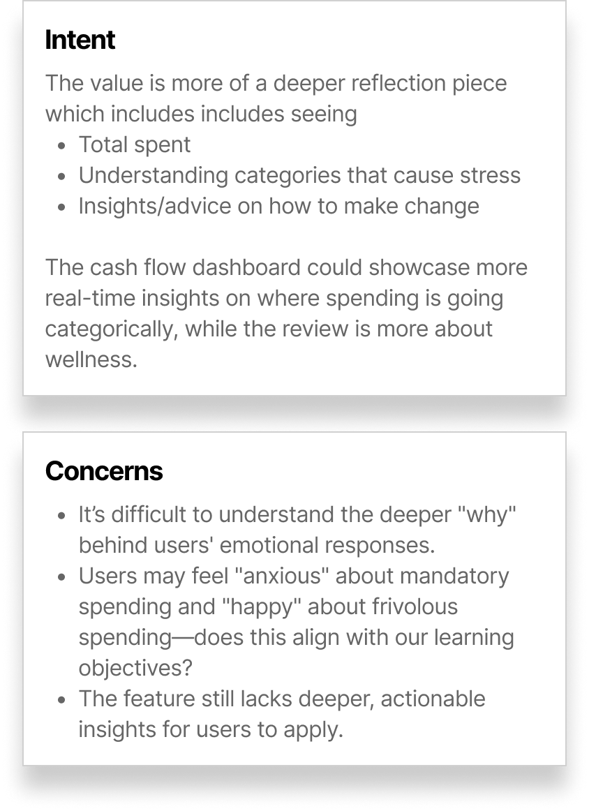
Intent: This was pushing the request the furthest, as the approach focused more on emotional impact rather than categorizing.
Feedback: The concept was well-received both internally and externally, as the emotional-impact element aligned closely with the broader product initiative for emotional wellness. While the Product Owner appreciated the swiping functionality, it was ultimately vetoed due to developer constraints and customer support feedback.
Step 1: Intro
Step 2: Reflect
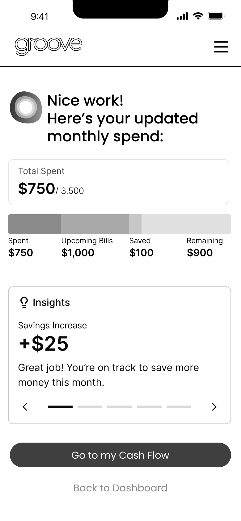
Step 3: Insights
Key Decisions With A Change Of Direction
Two Separate Experiences
As time became a growing concern, we shifted direction and I had a new path forward with 2 separate experiences:
A simple game to enhance engagement.
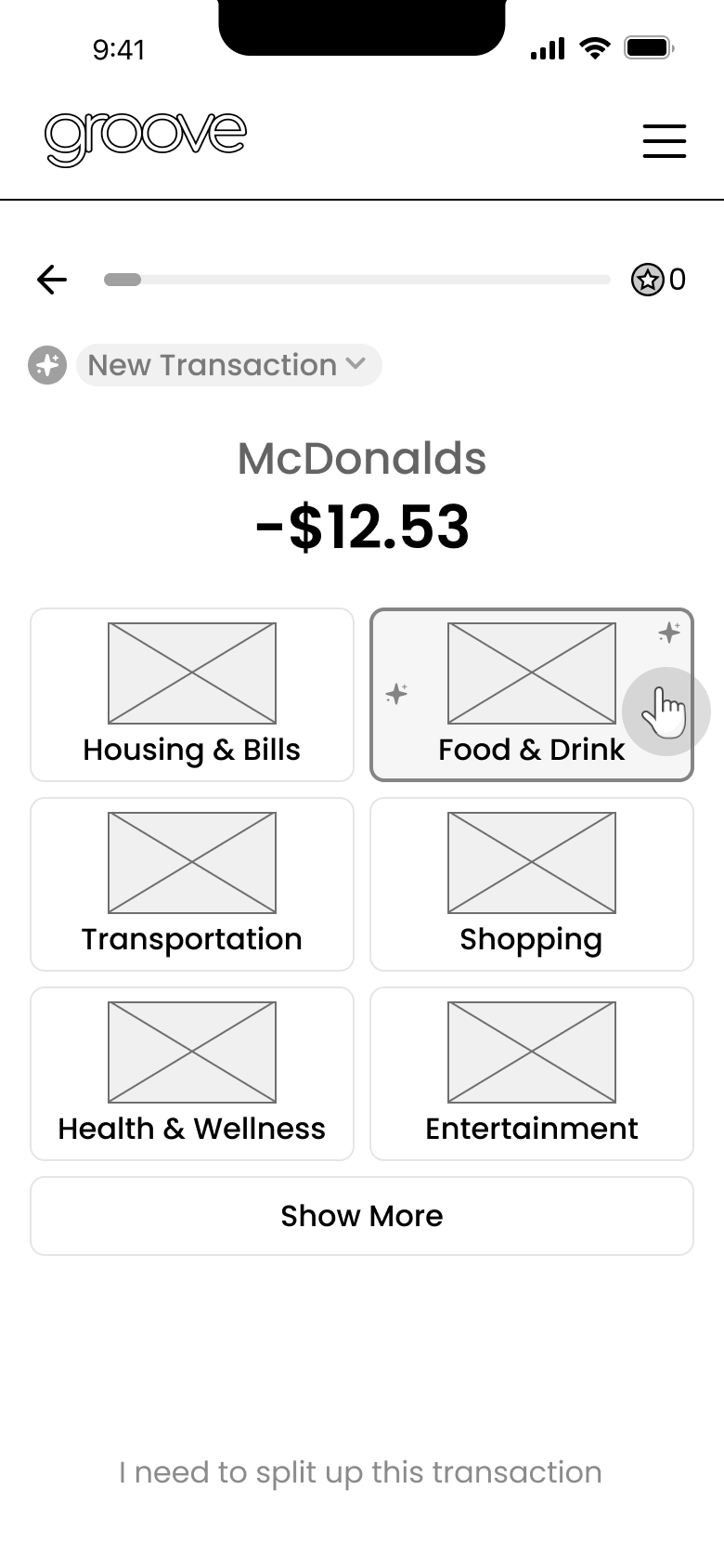
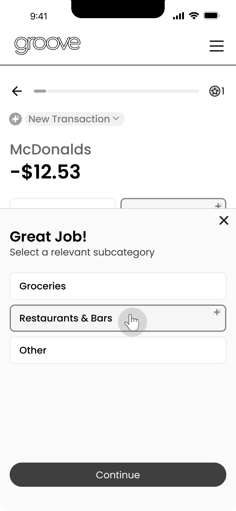
A quick sorting activity for low-confidence transactions only, with light gamification.
Experience 1: The Game
Ideating For A Fun & Meaningful Game Experience
With the new and more flexible requirements for a game, I began exploring various options.
My goals were:
Ensure simplicity to fit within our time constraints.
Align the game with the broader feature initiative of showcasing spending habits, patterns, and rhythms.
Option 1: Matching Game
The initial concept was a quick matching game centered around weekly spending in key categories.
Option 2: Guessing Game with Reflection
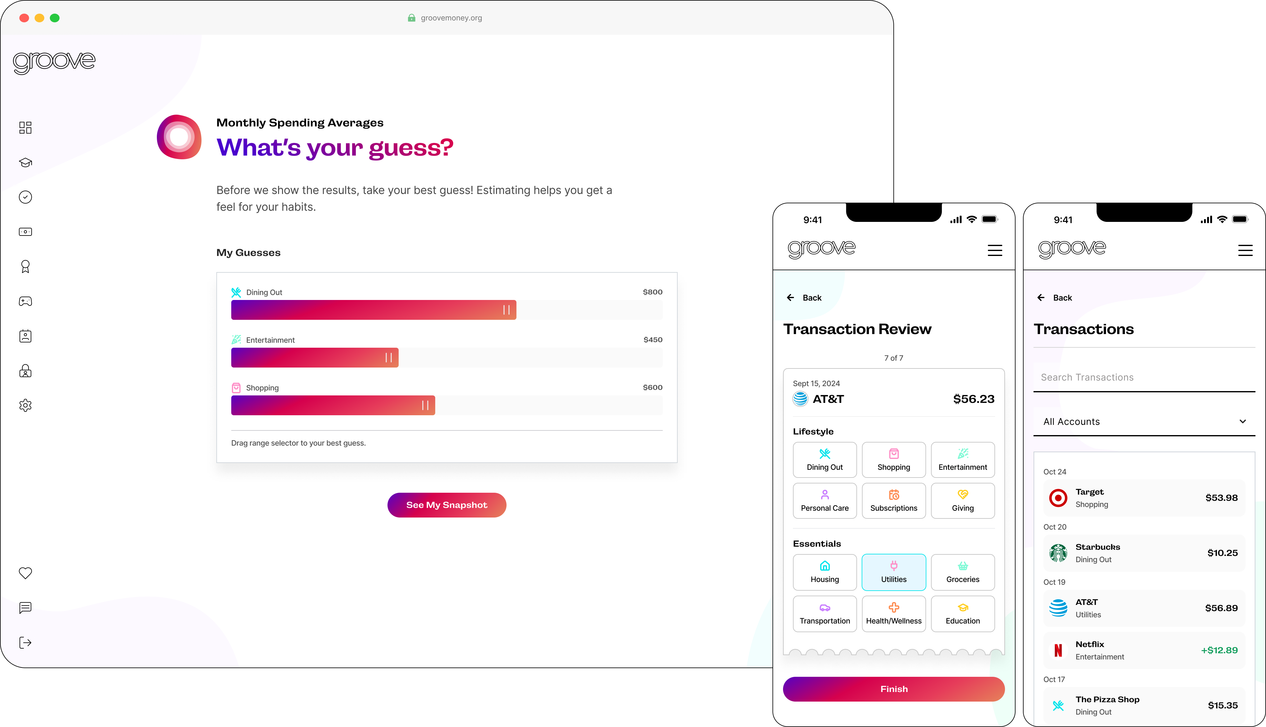
The second option I proposed was a guessing game to help users reflect on their spending habits. By guessing real numbers, users could gain perspective, often uncovering surprising patterns. This concept included a two-step activity: a spending review followed by recommended mini-goals for actionable insights.
The guessing game emerged as the winning concept, as it encouraged users to think critically and reflect on their spending more than the matching concept. However, it introduced a new design challenge...
The Challenge:
Feedback suggested a more interactive approach that minimizes user clicks.
The Final Game Solution
A Slider With a Dynamic Range
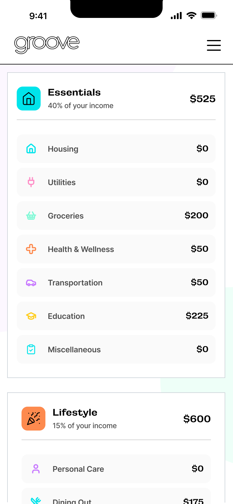
To minimize user clicks, I put the categories on one screen as a simple solution.
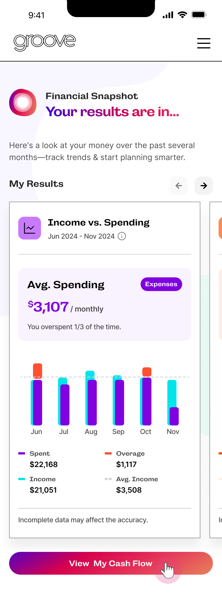
After testing the concept, it became clear that this guessing game was best suited for onboarding, because it'd be introducing users to their spending habits for the first time. And it naturally led into the deeper financial insights.
In the future, it could be expanded into a weekly or monthly review game, incorporating mini-goals for added value.
Step 1: Default
.png)
Step 2: Selection
.png)
Step 3: Result
.png)
Step 4: Snapshot Result
The Final Sorting Activity
Finalizing the Low-Confidence Sorting Activity
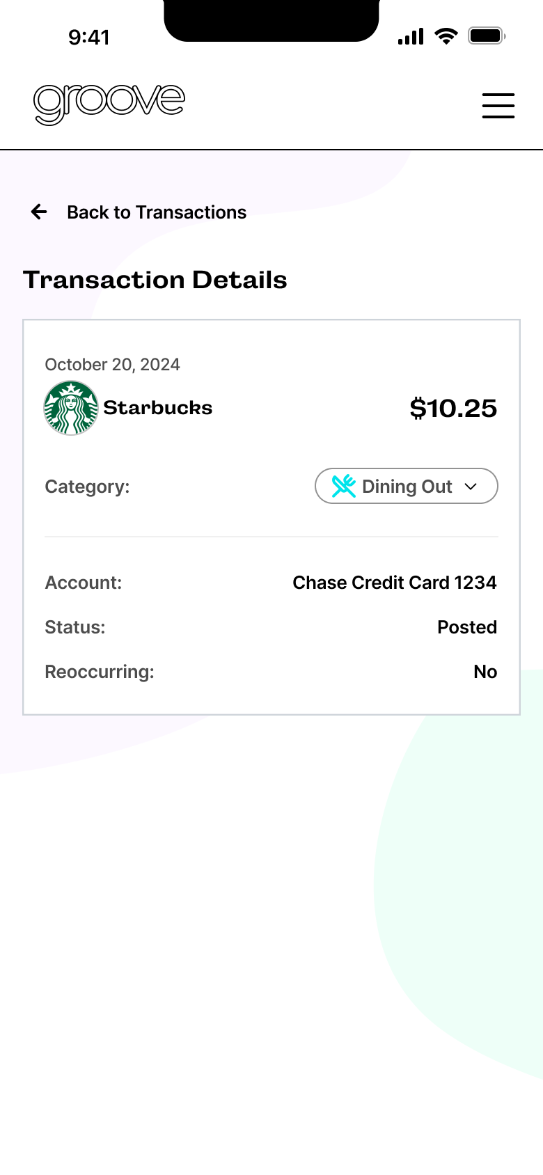
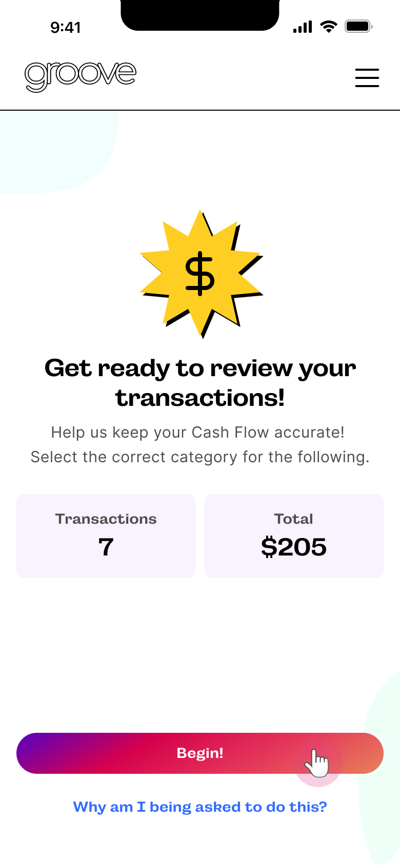
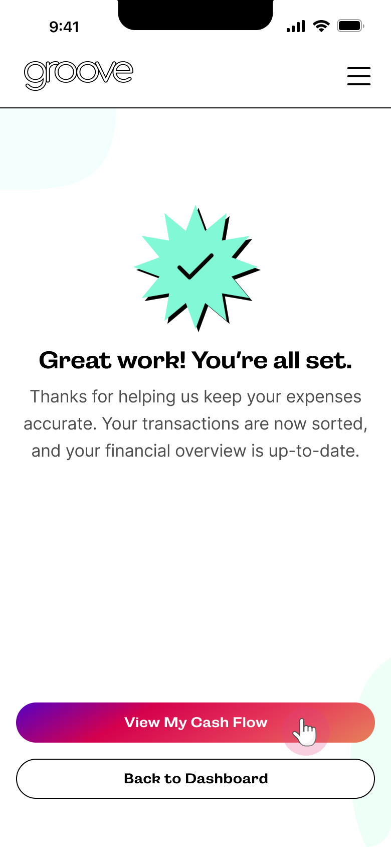
After further collaboration with our front-end team, the receipt UI was chosen as the preferred option due to its feasibility within the timeline. I focused on refining the UI and finalizing the categories. Once development began on the transactions, a few additional categories were identified and incorporated, making the page slightly busier than originally anticipated.
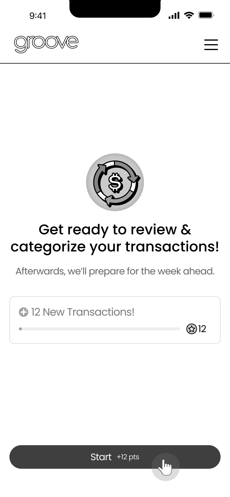
Step 1: The Trigger
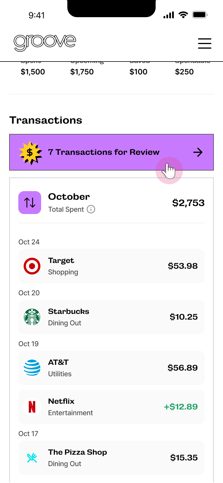
Step 2: Intro
Step 3: Categorizing
Step 4: Completion
Testing/QA
Making Slight Adjustments
I tested the new Cash Flow experience on our dev site, documenting bugs, quick design adjustments, and larger UX improvements for future phases. I collaborated with the team to organize all findings, ensuring even minor details received attention.
Final Thoughts
Reflecting On My Experience
Navigating Ambiguity and Shifting Priorities
This project underscored the importance of adaptability in the face of ambiguity and shifting priorities. With undefined goals and continuous feedback from multiple stakeholders, I focused on fostering collaboration and leveraging iterative design to bring clarity and structure to the process. Navigating these challenges reinforced the value of maintaining composure, embracing uncertainty, and driving alignment to transform complexity into meaningful outcomes
Aligning Stakeholders Through Design
I learned that design can be a powerful tool for aligning stakeholders by turning abstract ideas into tangible solutions. By using prototypes and visuals, I was able to bridge communication gaps, clarify goals, and foster collaboration, ensuring that all parties were aligned and working toward a shared vision.