Preducation

Adapting Curriculum into a Mobile App to Maximize Reach and Impact

A focus on the end-to-end design process, transforming curriculum into a digital experience to help teachers implement anti-prejudice lessons into their classroom.
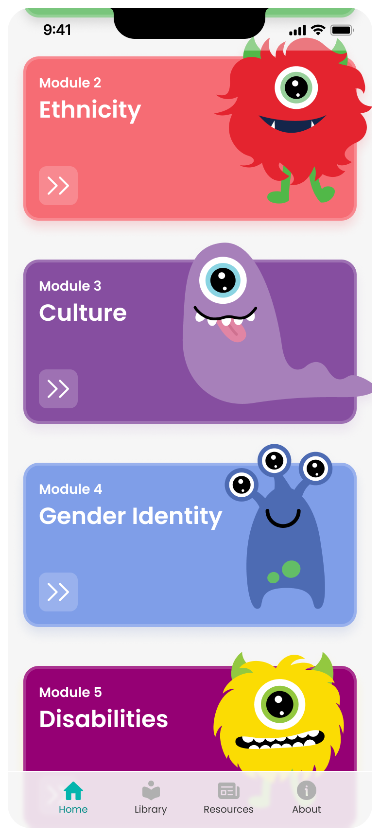
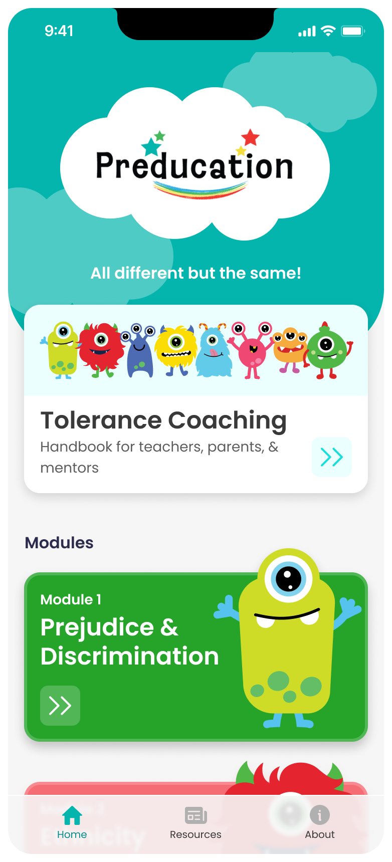
Home page
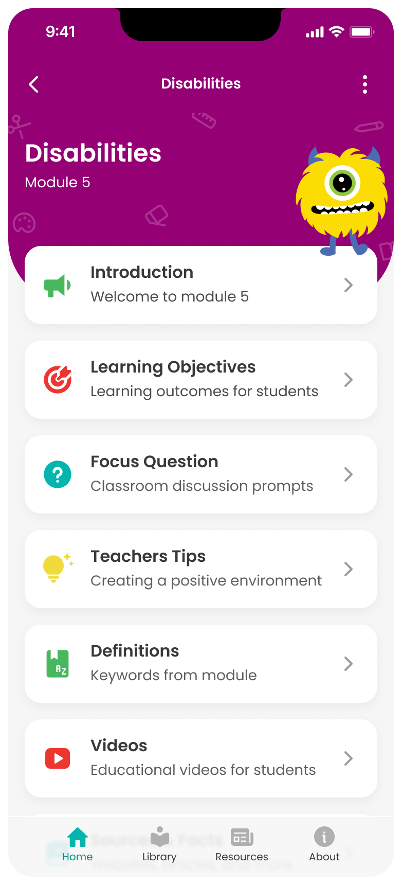
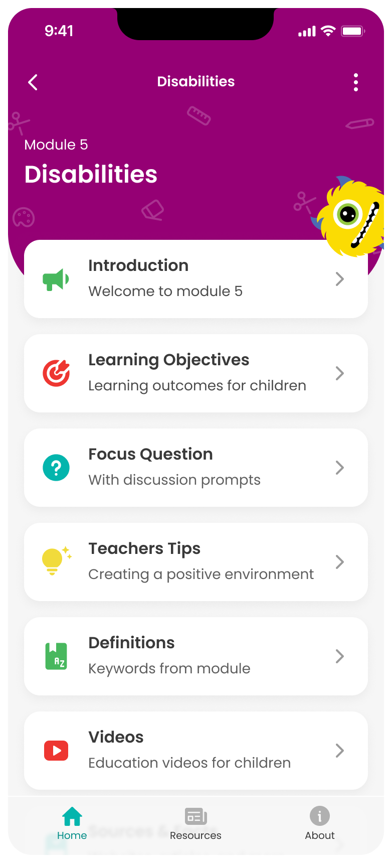
Disabilities Module Dashboard
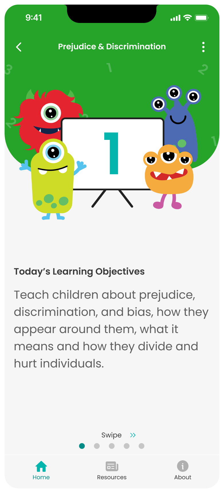
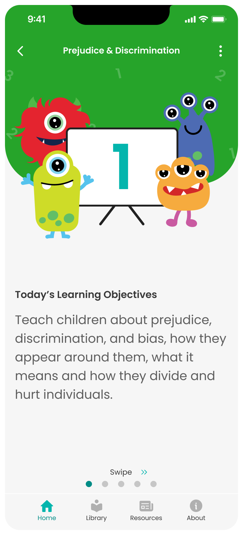
Learning objectives
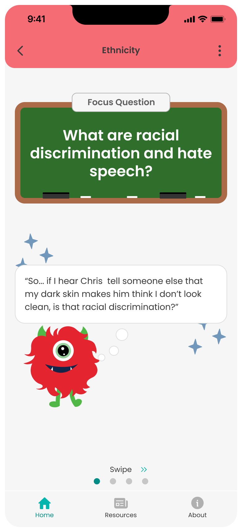
Question of the day
  • Client

    • The University of Central Oklahoma (UCO)
    • U.S. Department of Homeland Security: Federal Emergency Management Agency (FEMA)
  • The Team

    • 2 Product Designers
    • 3 Software Developers
    • 1 PM
  • Duration & Status

    • May-September 2023
    • App Launched September 2023

A Snapshot Overview

Preducation is a mobile app designed to equip educators with materials to teach  topics of prejudice to young children to help reduce the childhood violence crisis.

I helped lead the end-to-end design process for the app, focusing on transforming a curriculum of over 1,000 PDFs into an interactive, user-friendly, and visually engaging mobile experience.
‍
The result was a successfully launched app with over 350 downloads in the first few weeks, along with positive user feedback highlighting its excellent usability and engaging visuals.
The Why

A University Created Something Special...

They developed an elementary education program called "Preducation," which introduces topics of prejudice to young children with the ultimate goal of preventing violence across the state.
Original PDF designs of the curriculum
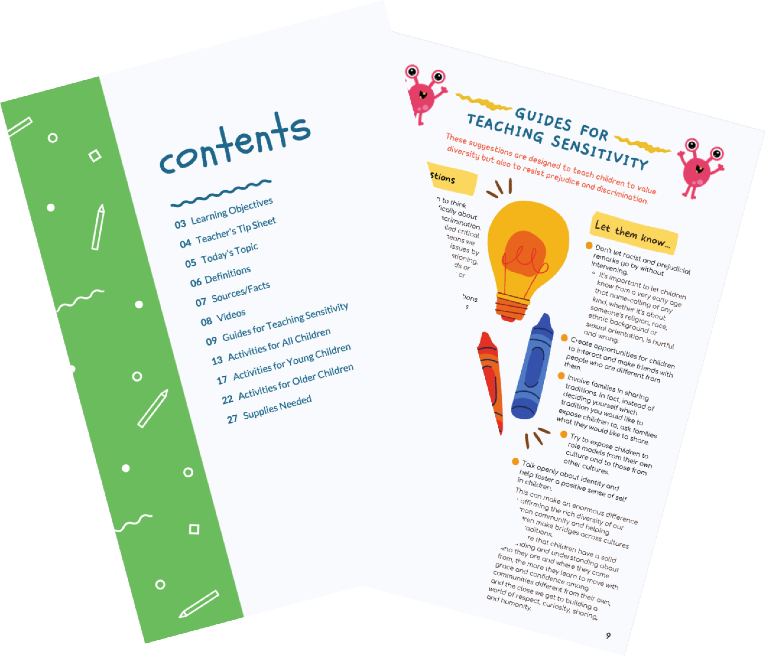
The original "Preducation" program

The Opportunity

A Mobile App

We set out to design and build a fully custom mobile app, transforming over 1,000 static PDFs into an interactive digital experience to broaden its reach and amplify its impact.
Example of PDF docs we were given to transform into a mobile app

Challenges & Constraints

Clock icon

Limited Time & Budget

The challenge was delivering designs within a tight budget and timeline, requiring a streamlined process.
Target icon

Building a Teacher-Centered Product Strategy

Defining the app's overarching experience with a focus on teachers' needs.
Dashboard icon

Transforming Content into an Intuitive Mobile App Experience

Designing around the limitations of content originally created for PDFs.
Code icon

CMS Integration

Structuring the information architecture to seamlessly fit into a CMS.

Getting Started

Selecting a Product Direction

The Challenge:

Determining the type of product and experience most useful for teachers in their daily schedules.
I brainstormed with my design partner and we came up with two possible approaches:
  1. A Modular Guided LMS (guided approach):

    This would guide users through the completion of modules in a selected order while tracking their current progress.
  2. A Resource-Based App (self-directed approach):

    This would enable users to independently browse, search, and find the resources they want to use.
I came up with some pros and cons for each approach to use as discussion points with the team. In the end, a resource-based app proved to be the ideal solution.

The Winner: A Resource-Based App

Top reasons for product direction solution:
  1. Scope (Time & Budget)

    It was quicker and easier to implement from both a cost and development perspective. The tight timeline was driven by the client’s urgent need to qualify for potential government funding.
  2. Better Fit for Teacher's Needs & Schedule

    Since teachers typically have only 10-15 minutes per week for social studies, we designed a system that allows quick access to specific module parts for resources or activities, rather than a guided linear approach.

Information Architecture

Crafting a Systematic Structure

The Challenge:

Due to the CMS integration allowing the client to adjust content in the future, I needed to create an information architecture that is systematic, reusable, and consistent.
To get started, I went through 3 rounds to come up with the initial structure.

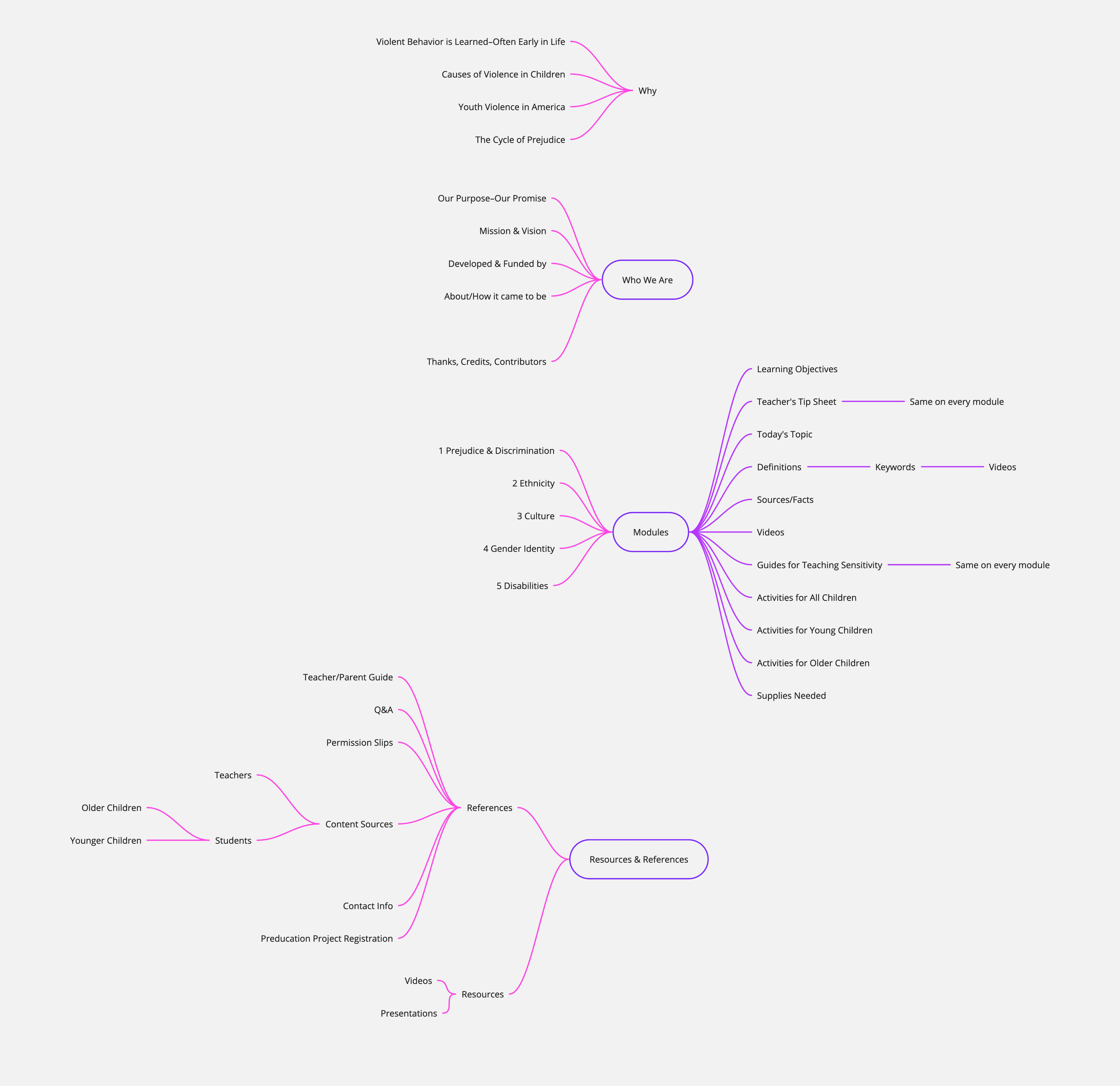
Round 1: Mind Map

I reviewed the 300+ PDFs and documented the content in a mind map. This helped me identify high-level relationships and begin building the foundation for the app's structure.
Mind map where I found relationships of all the content we were given.

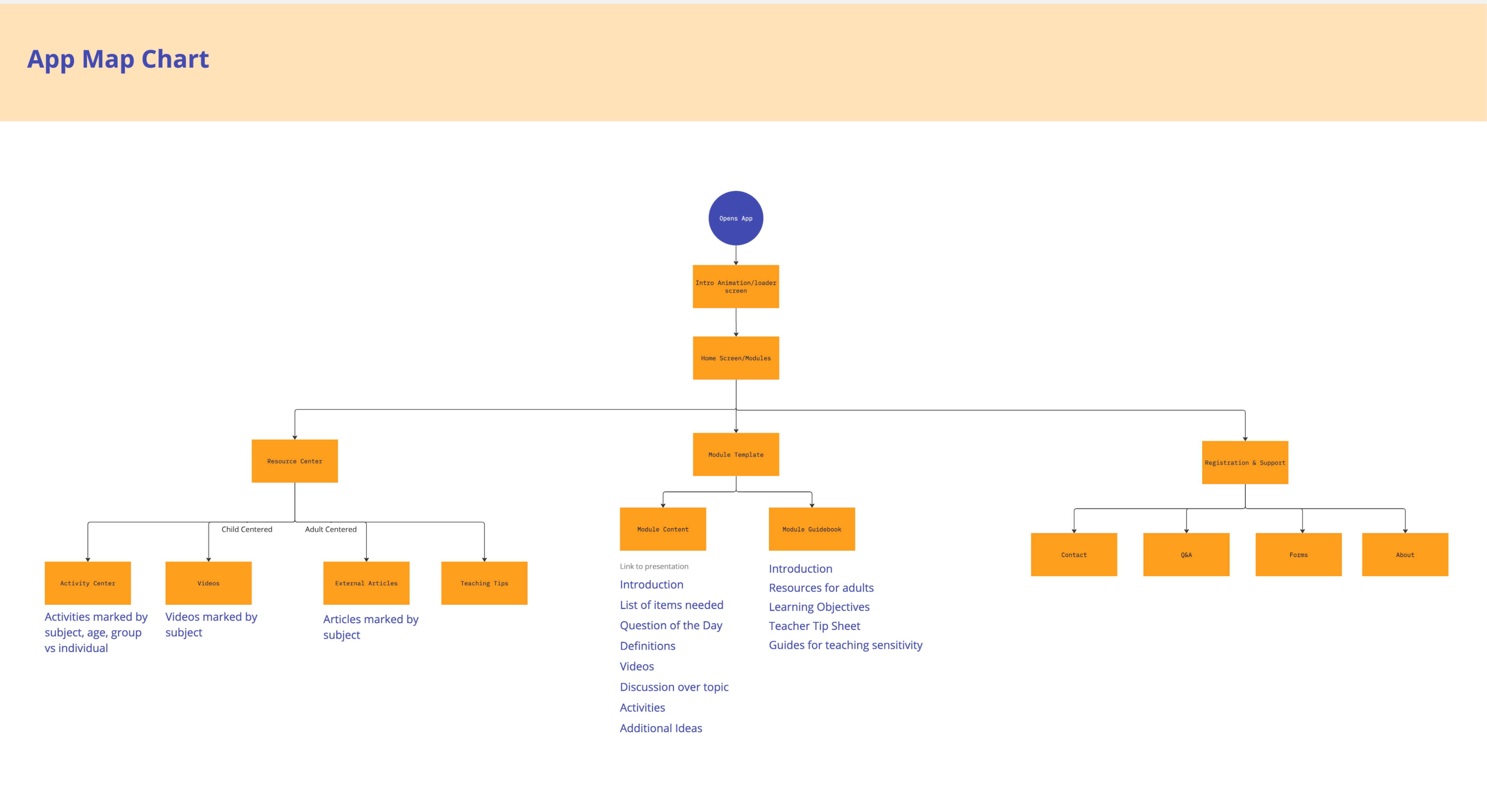
Round 2: Sitemap

I used the mind map to create a simple sitemap focused on navigation and flow. This was used to capture initial feedback, thoughts, and ideas from stakeholders.
Sitemap of the app

Round 3: Using Feedback to Create a Detailed Flow Chart

1. Content Library Feedback

The idea of incorporating a Content Library was well received. It was designed to help users quickly find resources, eliminating the need to search through each module individually. A few content changes were adjusted as needed.

2. Module Structure Feedback

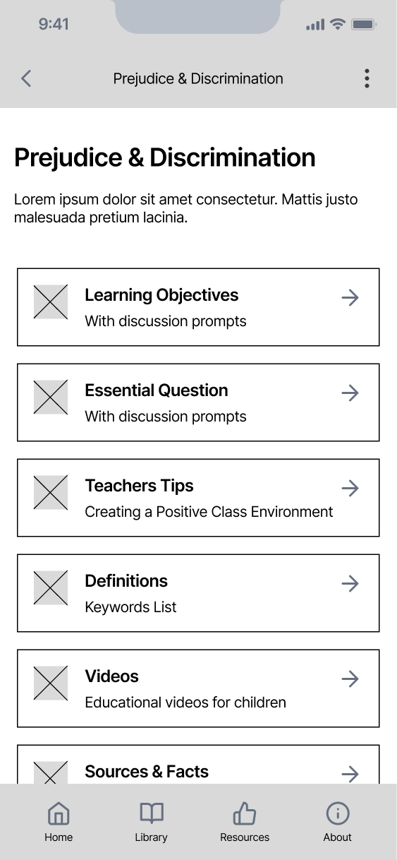
My initial idea was to split the modules into two sections: a guidebook and content. After a team discussion, we shifted to giving each module its own mini dashboard with all the content to simplify navigation, as the distinction between a guidebook and module might not have been clear to users.

Wireframes/Prototyping

Wireframing for Rapid Iteration

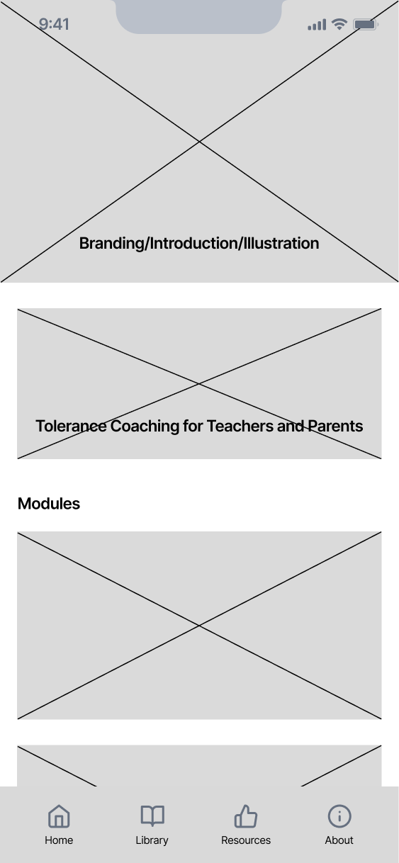
Since this was a new project, I wanted to quickly prototype wireframes before diving into high-fidelity design to focus on both form and function.
By quickly creating these wireframes I was able to come up with:
  1. Navigation Patterns & Layout

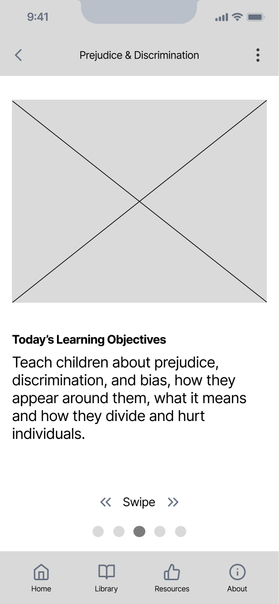
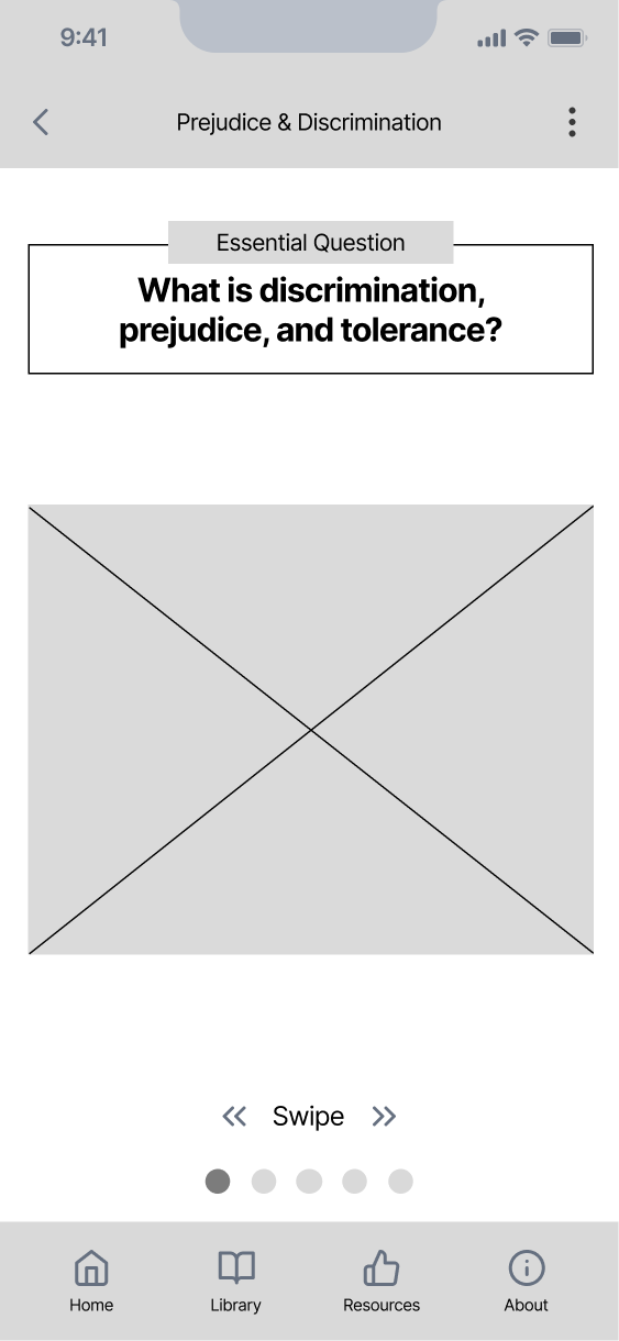
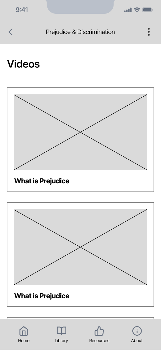
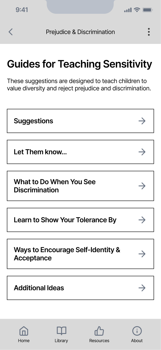
    Including a main bottom navigation, top bar for orientation and navigating back, and swipe navigation for a few short presentation screens.
  2. Enough Product Definition To Start Development Early

    Since time was a concern, these wireframes provided enough for development to begin their work.

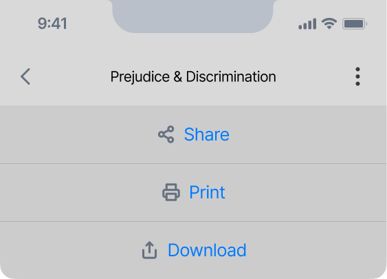
Key Takeaway from Wireframing: Adding a Print/Share Feature

Through ideation and wireframing I came up with this idea so I presented it to the team because:
  1. Creates a Larger Impact

    It would help achieve one of their main goals of reaching a larger nationwide user base, as teachers often share resources online.
  2. Fits Within Teacher Constraints

    Since teachers often can't use their phones while teaching, a printable version is valuable in this case.

User Interface

Creating & Applying a UI Style for Engagement

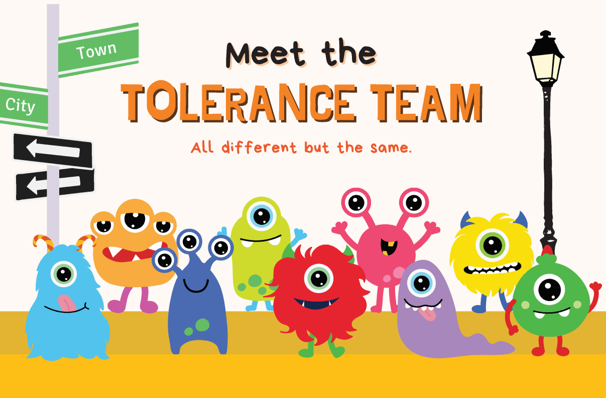
To save time and based on positive stakeholder feedback, we kept the existing colorful monster aesthetic. I collaborated with my design partner to create a fun, youthful color palette and typography. Thanks to my well-defined wireframes, I applied the UI styling quickly and added simple illustrations and Rive animations to enhance the experience.
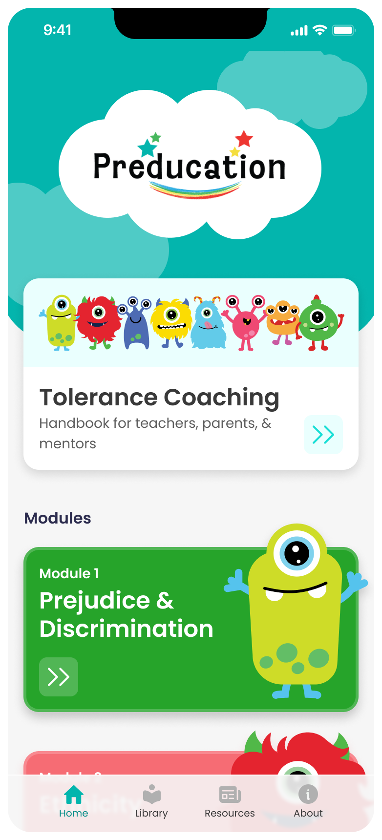
Home screen
Home screen scrolled down
Disabilities dashboard screen
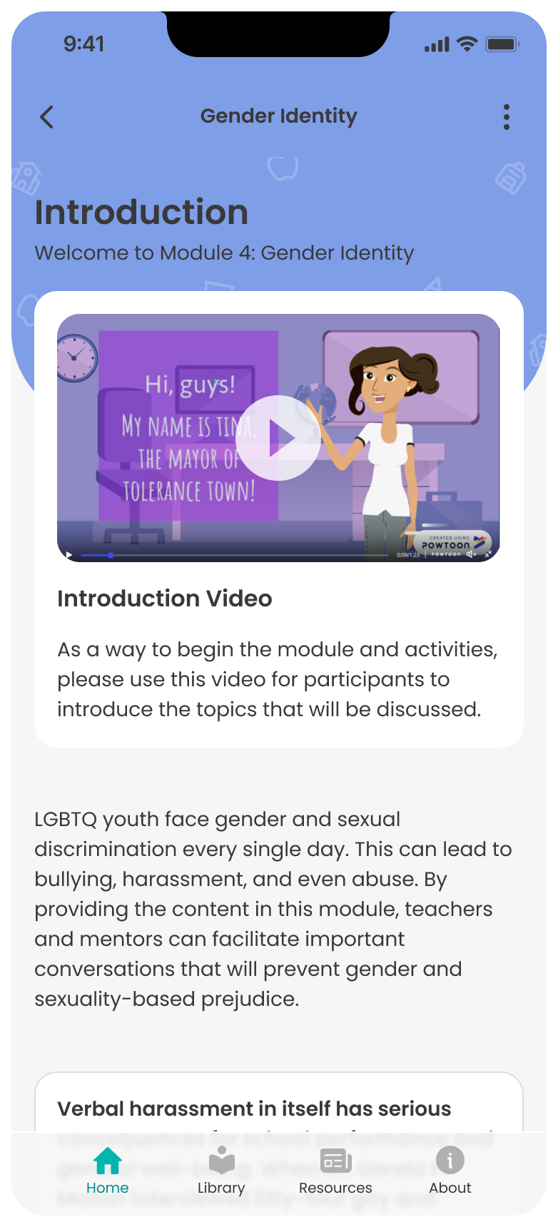
Introduction to gender identity module
Today's learning objectives screen
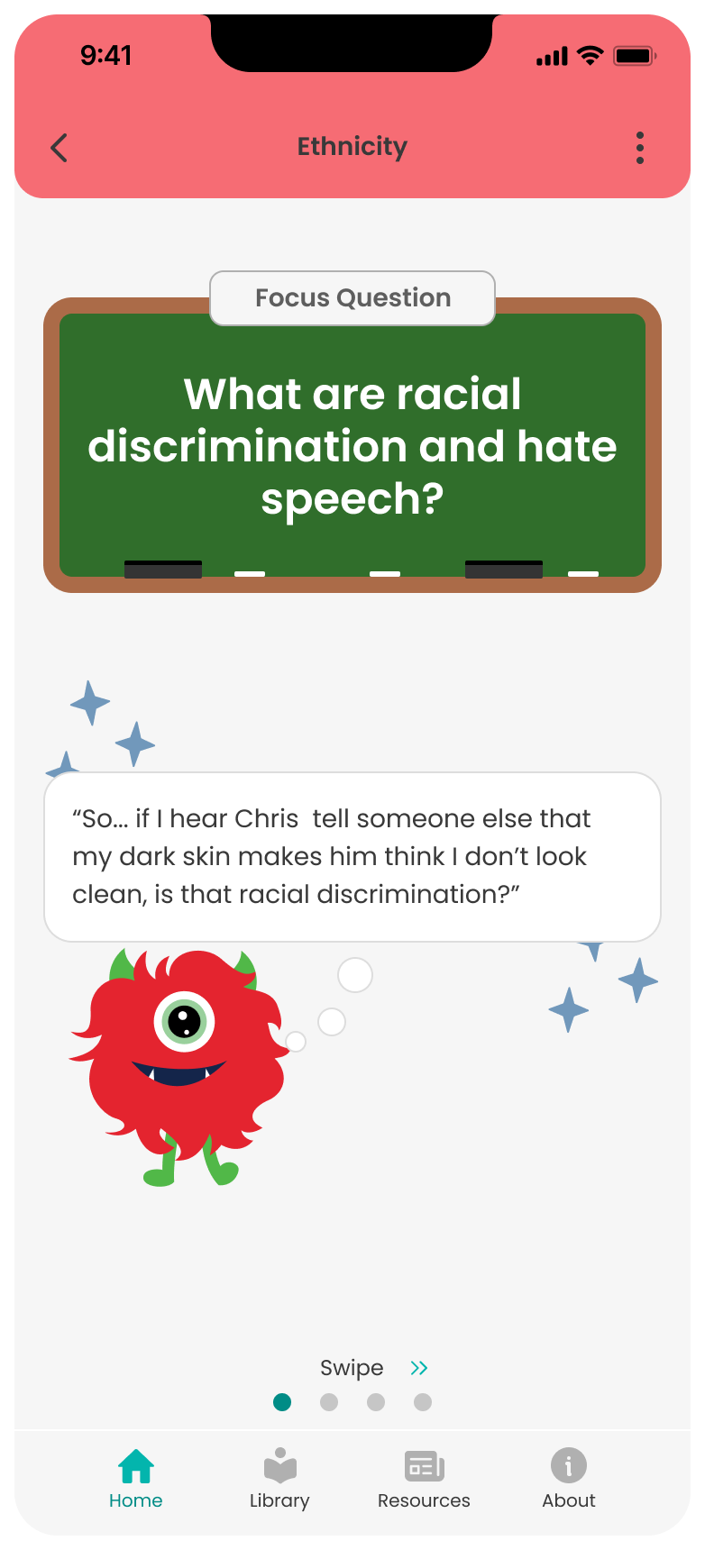
Focus question screen
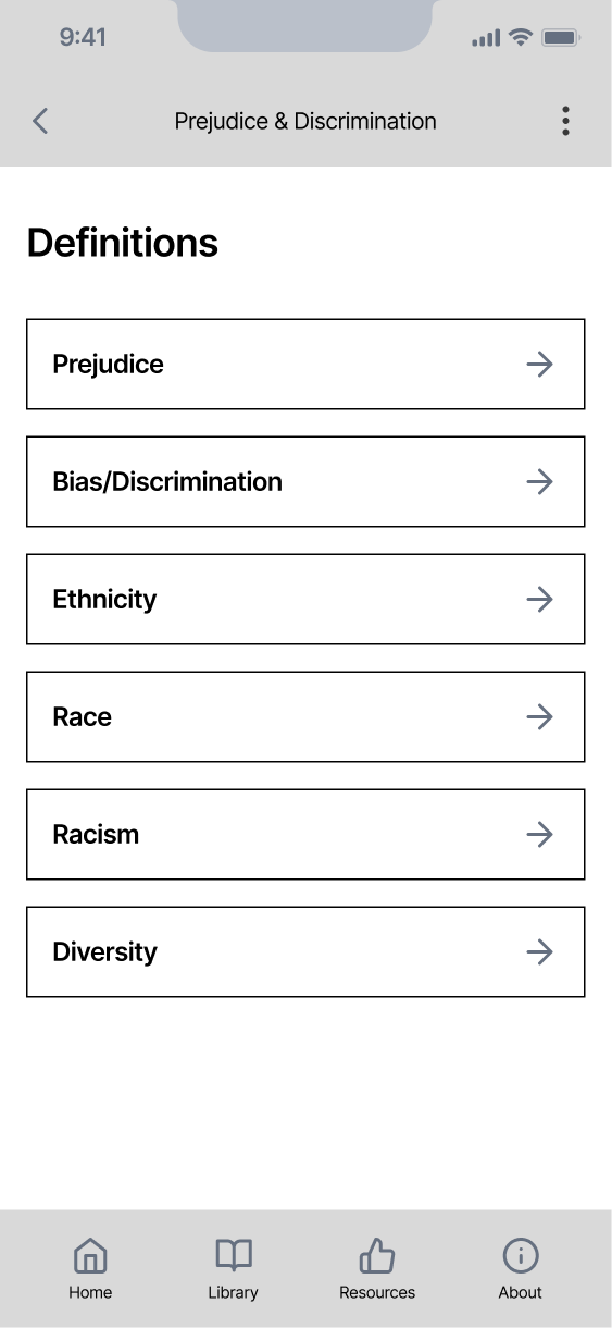
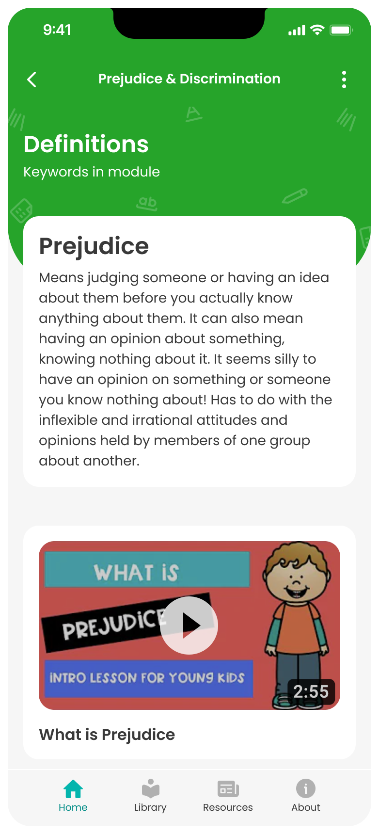
Definitions screen
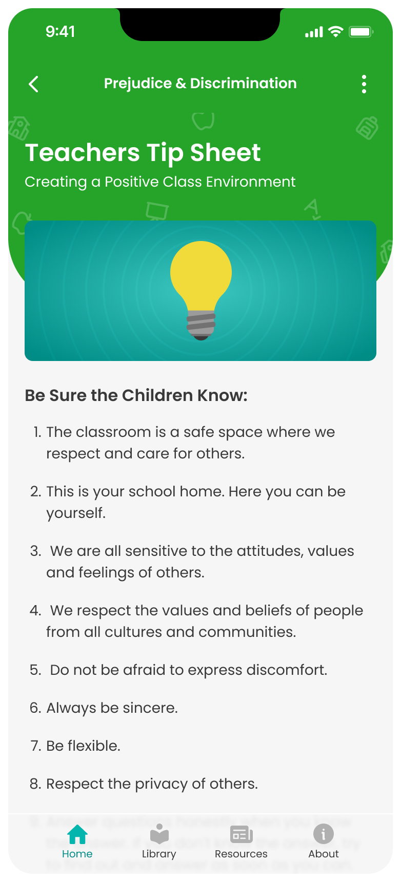
Teachers Tip Sheet screen
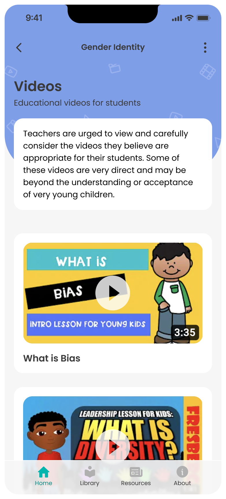
Videos screen
Guides for teaching sensitivity screen
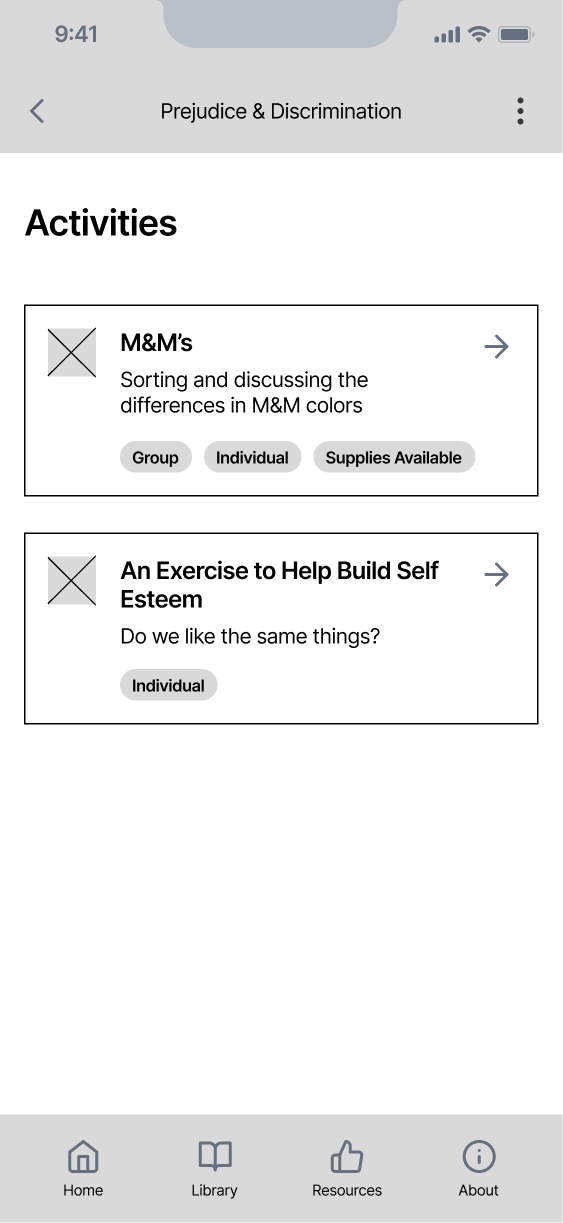
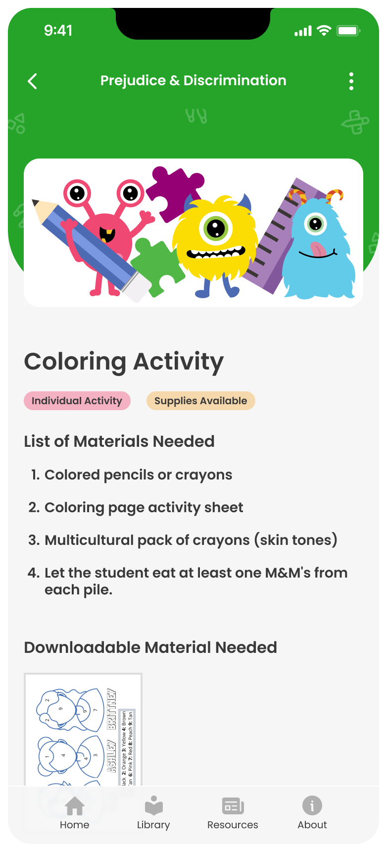
activities screen
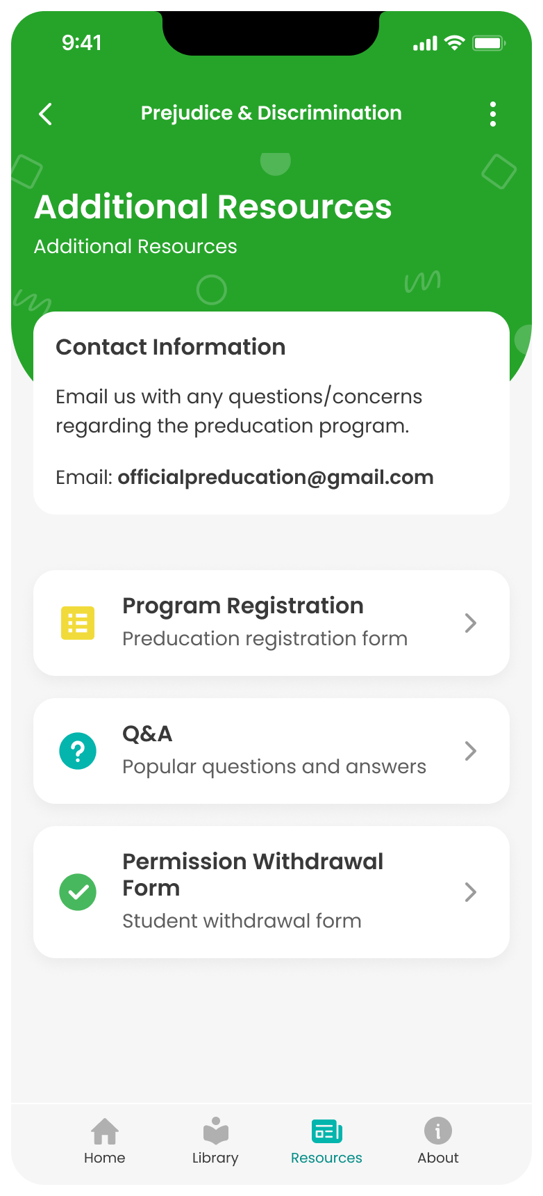
additional resources screen

Handoff & Beyond

Making Adjustments as Needed

To prepare for handoff, I ensured the file contained all the necessary information. I noted the slight content differences between the modules and designed any missing screens, which significantly sped up development time.
But of course, a new challenge arose.

Challenge 1

Development was struggling to build everything by the deadline.

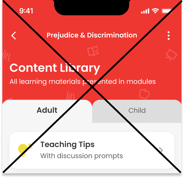
The Quick Win: Deleting the Content Library

In response, we decided to cut the Content Library from this phase, as it was more of a nice-to-have than a necessity
content library feature deleted
And a second request:

Challenge 2

We needed a way to promote program registration. Although the program is free, they wanted to highlight the additional resources and materials available to teachers.

The Quick Win: Adding a CTA

The quick win was adding a visible CTA on the dashboard for high visibility. The client could also easily remove it once the materials ran out.
Adding in a program registration link to the homepage

So, What Were the Results?

Although user feedback was limited due to the nature of the contract, the results and feedback we received were extremely positive.
350+ app downloads in the first few weeks.
40+ Registrations for additional material
Positive Usability Feedback: "I love how easy it is to use!" -Teacher

Final Reflection

What I Learned from this Experience

Overall, this project was a success. I enjoyed working on something with a strong, mission-driven outcome. Here are a few key takeaways:
  1. Designing Around Large Constraints

    Due to time and budget constraints, I had to move quickly to initiate development. This required me to be highly intentional in my actions, constantly asking myself, "What problem are we trying to solve by doing this?" to ensure I stayed on track.
  2. Collaboration is Key for True Success

    As this was my first major project, it was also my first experience working with a cross-functional team. I quickly realized that seeking feedback early and often was key to staying aligned. Some of my early ideation ideas were rejected due to development time constraints, which helped me develop a deeper empathy for the challenges our development team faces. This close collaboration fostered my growth and understanding of their challenges.

Check Out My Other Work!

Back to Top