Indigenous Class
Designing a Streaming Platform to Empower Future Indigenous Leaders
The design of an MVP streaming app focusing on signing up, subscription management, and viewing classes for Indigenous education.
Client
The Team
- 1 Product Designer
- 2 Software Developers
- 1 PM
Duration & Status
- June-September 2024
- App Launched late 2024
A Snapshot Overview
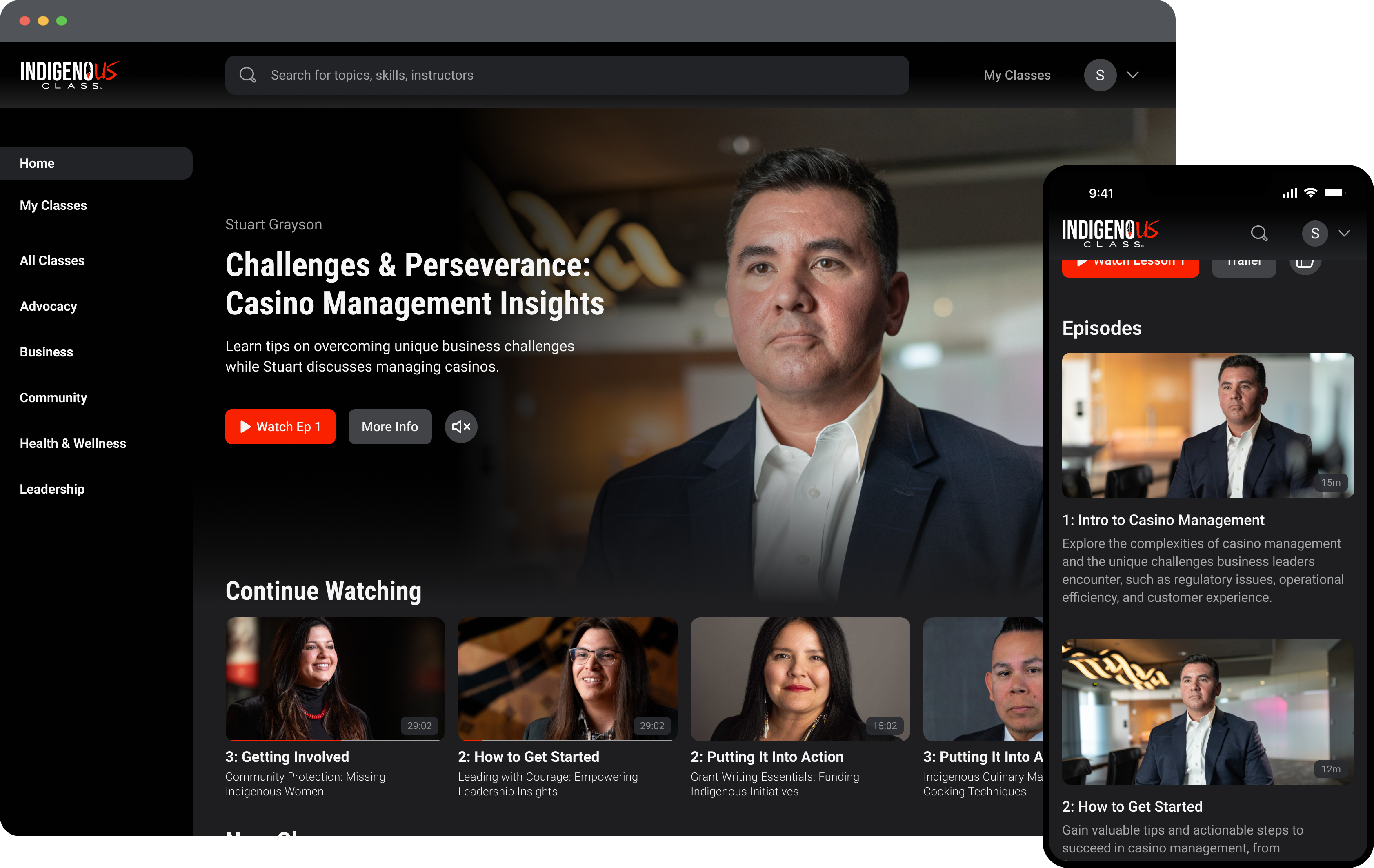
Indigenous Class is a responsive video streaming web app designed to bridge the gap in education and opportunity for Indigenous citizens.
I led the design process for the MVP, focusing on the structure, interface design, and user flows for signing up, subscription management, and viewing classes.
The result was a successful app launch, receiving positive feedback for its simplicity, ease of use, and modern interface.
The Vision
Bridging the Gap in Education and Opportunity for Indigenous Communities
Indigenous Class recognized a gap in accessible, culturally relevant education for indigenous youth and citizens.
To address this, they envisioned a streaming platform with short video courses that celebrate indigenous heritage while fostering professional skills, aiming to empower the next generation of indigenous leaders. To achieve this, we began our journey building an MVP of an responsive web application.
Challenges & Constraints

Limited Time & Budget
With these limitations, quick iterations and focusing on simplicity was key.

Client’s growth and future vision lacked clarity
I needed to design a scalable system, despite an uncertain path forward.

Unique tribal management business logic
I needed to figure out what the subscription model experience would look like for a unique use case.
Structure
How Will Users Discover and View Classes?
Challenge:
Creating an initial structure with just five classes, despite uncertainty about future scalability
The product would begin with five videos and categories for the app's launch. While more videos and categories were planned over time, the specifics were unclear. My goal was to create a system that could scale.
Decision 1: Adding Sidebar Categories
I chose to list the class categories in the sidebar for easy discoverability, using broad categories to accommodate future subcategories. Each category has its own page, which may initially appear sparse, but this approach gives the business maximum flexibility to manage content over time.
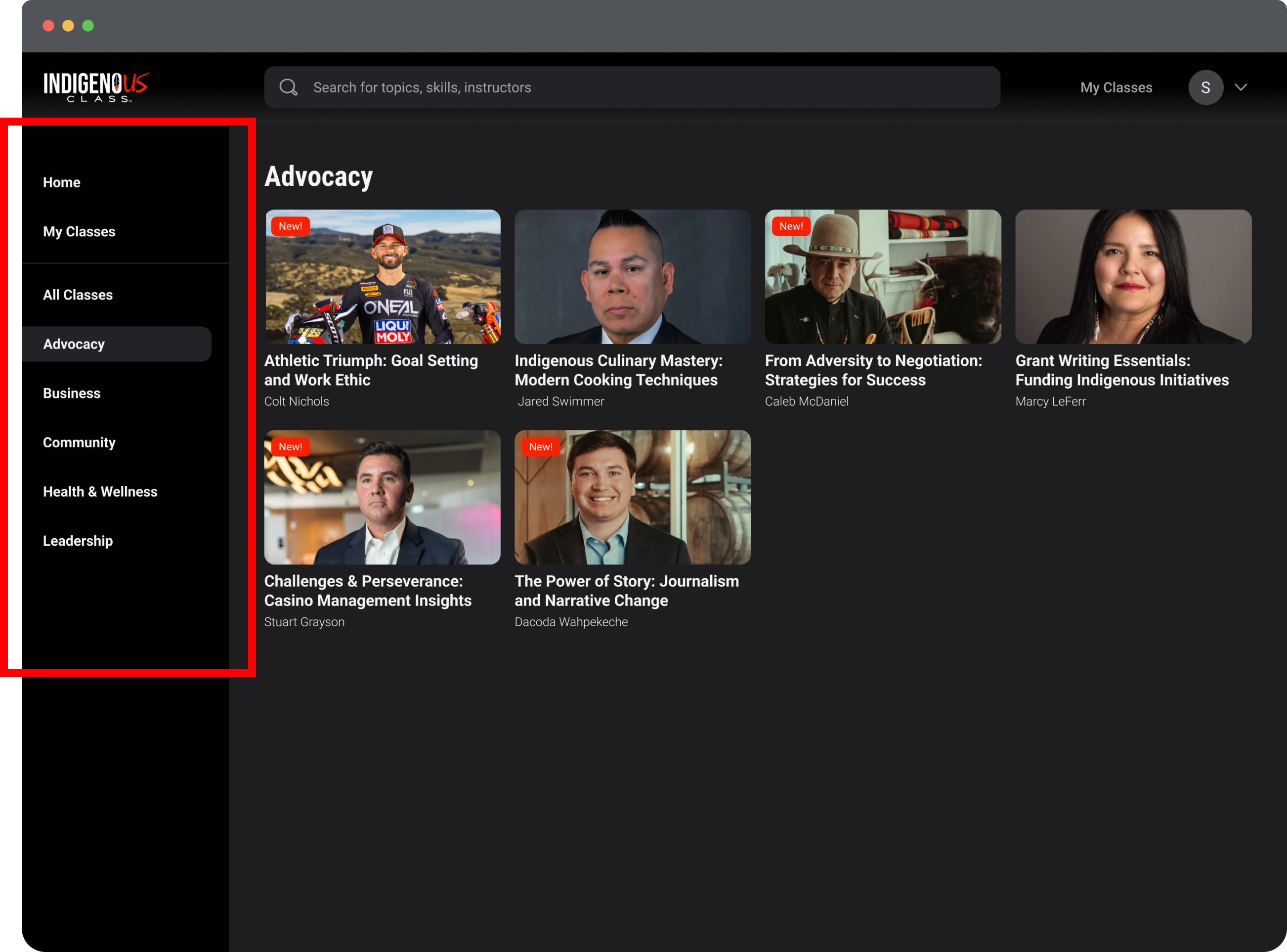
High-level categories displayed on a sidebar
Approach 2: Adding a My Classes Page
During discovery, there were many ideas about how users could interact with and locate the classes they had started. I proposed a 'My Classes' page. Initially it was designed to help users resume or continue to the next episode. Over time, it could evolve to include features like bookmarking and completion badges.
While working on a class feedback feature later in the design process, I realized users needed a way to view completed classes and update their feedback, so I added a finished classes section.
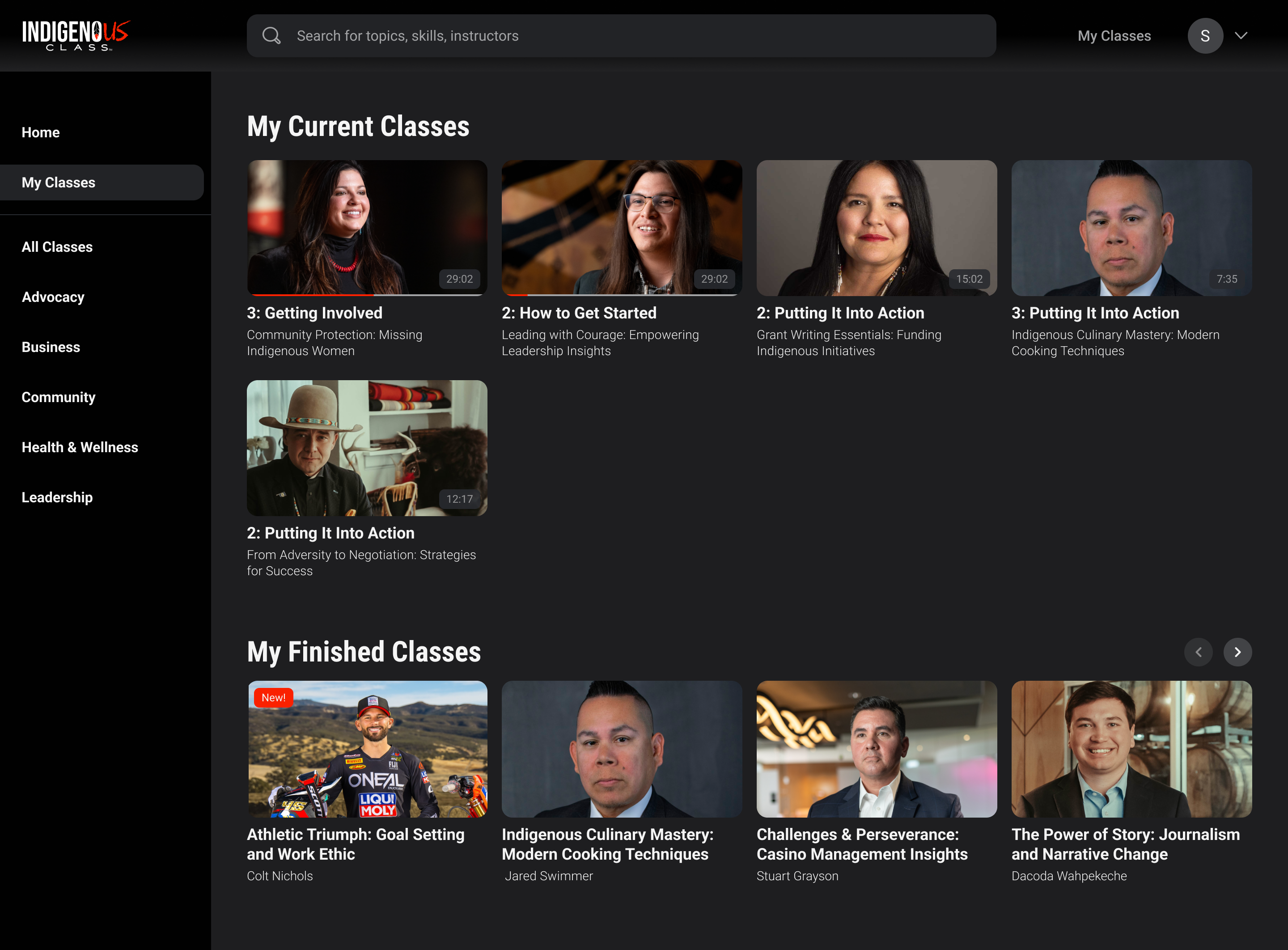
The 'My Classes' Page
Flow 1: Deciding on the Main User Experience
Viewing a Class and Episode
The Goal:
Design a streamlined, intuitive interface that minimizes visual clutter to emphasize key actions and content.
Adding an Intro Screen
I proposed adding a class introduction page to give users more context, particularly when navigating from the homepage. This page would include class trailers, a brief description, and relevant tags. The team recognized its value, and we included it in the scope of work.
The Prototype: Viewing a Class & Episode Flow
Focusing on simplicity, the user journey flows seamlessly from the homepage to the intro screen, then to the viewing screen. The viewing screen remains minimal to keep users engaged with the video, even in non-full-screen mode. Episodes auto-play, and the sidebar enables easy switching between classes.
Flow 2:
Subscription Management
Challenge:
I needed to find a simple way for users to sign up under pre-paid memberships provided by their tribes.
The business strategy focuses on securing bulk subscriptions through tribal partnerships, which will promote the product to their members. Initially, most users will come through these bulk subscriptions, not individual purchases. Two key circumstances needed consideration.
1. Primary Use Case: Signing Up with a Code
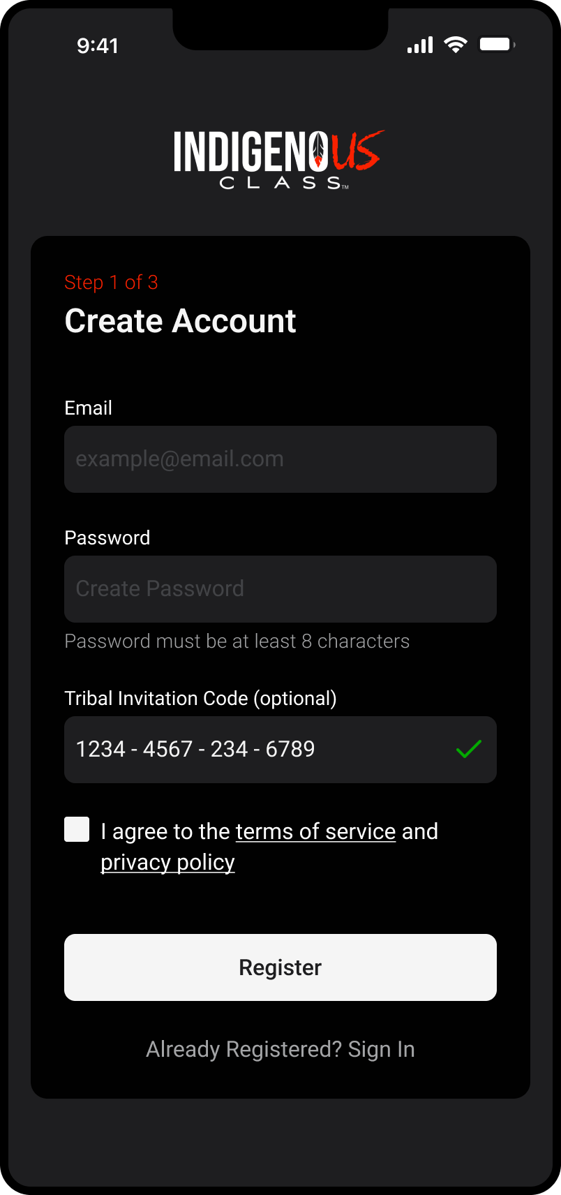
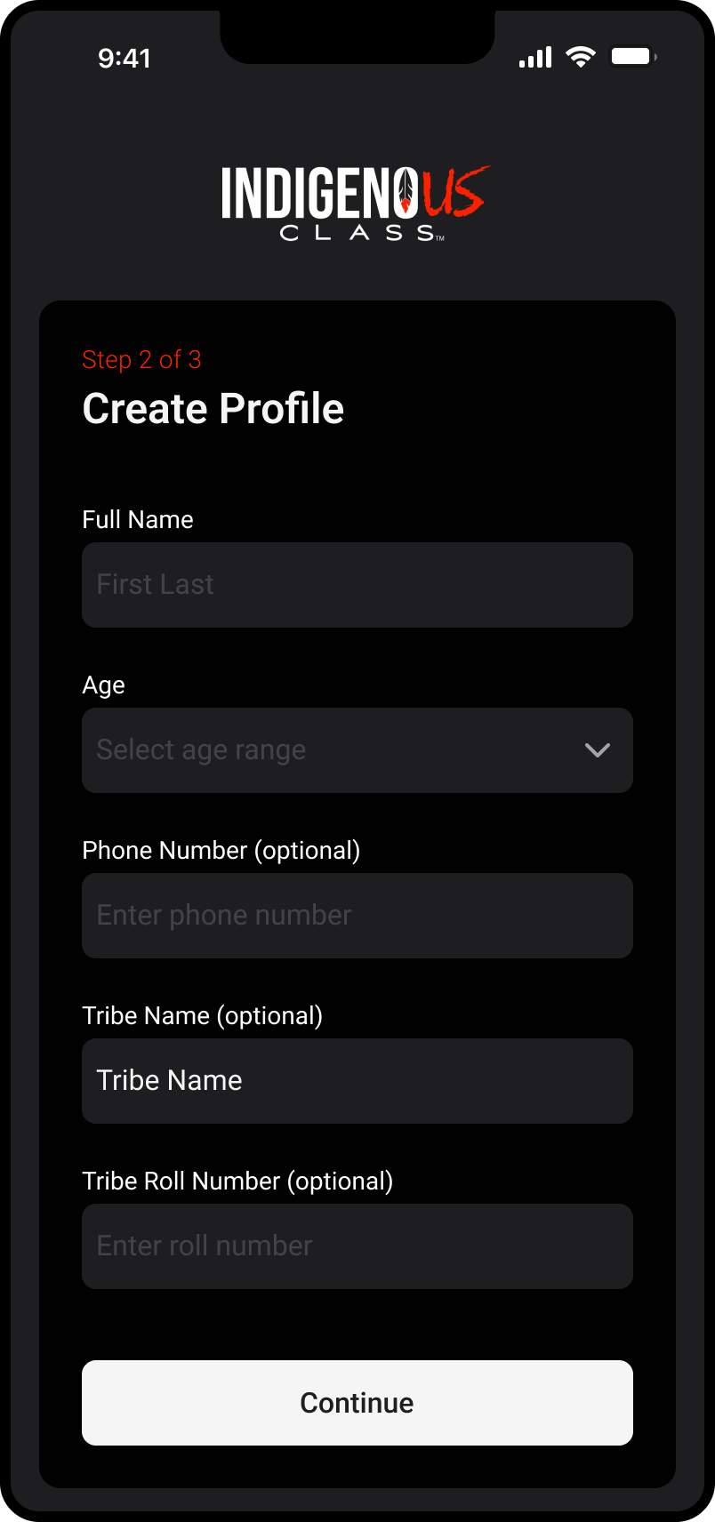
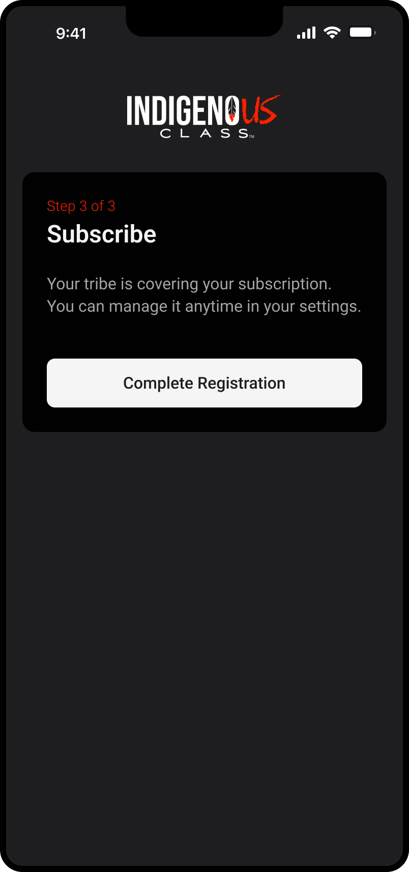
The primary use case involves users signing up with a unique code from their tribe. A special email link pre-fills the code on the signup screen for easy verification. To keep the process simple, I broke the signup into three clear steps across separate screens.
2. Secondary Use Case: In-App Management
A rare use case involves users connecting or disconnecting a tribal membership after signing up. I decided to place this option in the settings for easy access.
Drumroll Please...
The Successful Launch
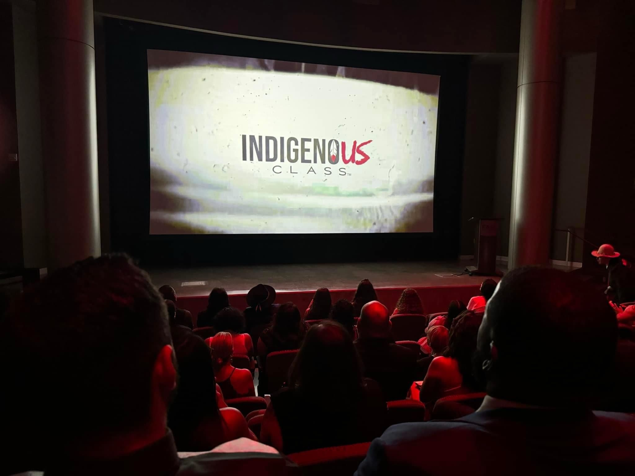
The app is expected to launch in late 2024. The clients and early testers praised the product for its simplicity, ease of use, and modern interface. A red carpet event was held in Fall 2024 to unveil the product to hundreds of Indigenous leaders and community members.
Reflection
What I Learned
Prioritization in Design:
Working with an unclear scope of work made prioritization challenging, as it was difficult to determine what features to include and how much detail to focus on. To navigate this, I focused on the core user journeys and essential functionality, ensuring the MVP would deliver value while remaining adaptable for future updates.
The Power of Simple Design
The short timeline and budget for this project reinforced the value of simplicity and streamlined design. As an MVP, focusing on core functionality allowed me to move quickly without getting bogged down by “what if” scenarios. This approach not only kept the process efficient but also directly contributed to the positive feedback we received for the app’s ease of use and intuitive design. It highlighted how simplicity can be a strategic advantage, especially when working within tight constraints.